Summer 2023

Model Row at Red Fox Run

Curious about the latest design trends? Rodrock Homes showcases one of each!

Words by Andrea Darr  |  Photos by Brynn Burns

Coastal

Shay Edwards Interiors creates a calm and elevated environment that engages the senses.

Design by Shay Edwards Interiors

The touch and feel of the Rawlings II should make potential buyers feel at ease. That was designer Shay Edwards’ intent for her organic Coastal theme at one of Sundance Ridge’s model homes at Red Fox Run.  

It’s definitely ‘less is more,’ all while serving an elevated lifestyle. Shay focused on neutral colors, natural materials and texture, especially in art. 

Art selection was a prominent factor in assembling the look and feel of the home—and also in Shay’s personal life. 

“Every time I go on vacation, I ask where to find local art and usually pick up a small piece to bring back to my own home for the memories,” Shay adds. 

Inspired by a triptych she saw at High Point Market, she hired Wendover Art Group (where she sourced all the art in the house) to customize three paintings of gold lines and shapes to fill the tall expanse of the living room. As large-scale as they are, the content reads minimalistic. Although they are hung high, if you could touch them, you would feel the texture.

Shay added a moment of drama behind the pieces, painting the two-story expanse that flanks the fireplace in Sherwin-Williams’ Moscow Midnight. 

“It couldn’t be all white on white on white,” she explains. 

She also brought texture to the kitchen backsplash, selecting from Wow’s ceramic tile collection. The handmade tiles have a solid option and one with organic lines in gold, and Shay mixed them up throughout the long perimeter space for added interest.  

She also mixed things up in other spaces, like the office. The live-edge silver desk and gold accents on the art of our Founding Fathers is a fun pairing done tastefully.  

“I love mixing metals,” she says. “I don’t match anything.”

Shay also isn’t afraid to use wallpaper, especially in open floor plans, where something is needed to offer a sense of separation between connecting rooms.  

For example here: The dining room is wallpapered in soft blue vertical stripes, punctuated by a large print of a marshy coastline that perfectly captures the tones of the nearby kitchen cabinetry. 

The cabinetry was yet another creative way to play with her given budget. Instead of ordering popular white oak cabinets, she chose alder with a stain that mimics the look. 

“It doesn’t have the same lines as oak, but the color is almost dead on,” she says. 

With so much to take in, Shay knows there is a takeaway moment for everyone who visits the home. 

“There has to be at least one thing here for buyers to remember it by,” Shay says.


Connect on Instagram
@shayedwardsinteriordesign

Modern Mountain

Earthy colors befit comfortably sized spaces in balance and harmony.

Design by Kristen Ridler Interior Design

In her 10 years of design with Rodrock Homes, Kristen Ridler has always given the people what they want, but this time, she wanted to take a bit of a risk—with color. 

Given the theme of Modern Mountain for her model home at Red Fox Run at Sundance Ridge, Kristen and lead designer Kelly Gilhaus selected Sherwin-Williams’ Cascades for the exterior paint color—a deep, rich green reminiscent of forest pines.

“I was tired of all the white, beige and gray houses and wanted to have a little fun with color,” Kristen says. “I was a little nervous, but you’d see this color on homes in Colorado.” 

Green, along with brown—leaf colors, Kelly notes—continue to dominate the palette inside, where the designers wanted to warm the spaces. They tried to stay away from gray, which cools spaces, except for the charcoal-colored stone fireplace that is a focal point of the living room. They also went with a few deeper, almost-black accents, using Sherwin-Williams’ Iron Ore on the kitchen’s ventilation hood and bar area. 

Kristen and Kelly also incorporated a few unexpected design moments when they made asymmetrical decisions on the fireplace and island. Rather than a centered fireplace with shelves on either side, they opted for elongated, horizontal shelves on one side. They repeated the idea on the island, where barstools are on the back side “like normal” but also on the side. The stairwell spindles were installed horizontally, repeating the motif. 

“We wanted to do something different,” Kristen says. “It’s a bit of a Frank Lloyd Wright touch.”

The Campbell floor plan is especially conducive to this design moment, with its cozy scale and proportion. 

“The ceiling height and room sizes feel very comfortable,” Kelly says. “Plus, with our furniture selections, it doesn’t feel so formal, like you couldn’t see yourself living there.” 

Kristen specializes in modern style, but here, she wanted a more Transitional vibe. 

“She always slants toward cleaner lines and lower profiles,” Kelly notes. “This is also nature-inspired, with natural materials like jute rugs and warm accents on the cabinets and furniture.”

The kitchen backsplash is relatively understated in white quartz that runs up from the countertops. 

“It is more timeless,” Kristen says. “It can be hard to pick out a tile you’ll like forever.” 

However, on the lower-level bar area, the designers went all out, choosing a bold marble mosaic featuring brushed brass triangles. 

“I fell in love with it,” Kristen says. “It’s funky and unexpected.”

Lighting and art also make lasting impressions throughout the house, bringing organic shapes to eye level. “This house was fun working start to finish on,” Kelly says.


Connect on Instagram
@kristenridlerdesign

Modern Transitional

A mix of glamor, organic texture and an unexpected funky factor brings stylistic edge to a new floor plan.

Design by Laughlin Design House

Molly Laughlin of Laughlin Design House never does the same thing twice, and The Providence—a brand new floor plan at Red Fox Run—is better for it! 

“We wanted the house to be super cool but replicable,” Molly says. “If it were too far out, it would be overwhelming.”

Molly, who has been attending the HBA Parade of Homes since she was five years old and now designs for it, approached the process almost instinctively. 

“I know you’ve got to give them something to remember,” she says. 

“There are elements of the same style in all of the models, but we wanted to bring in some funk to anchor all the modern elements,” she adds. “We wouldn’t normally combine those, but it works.”

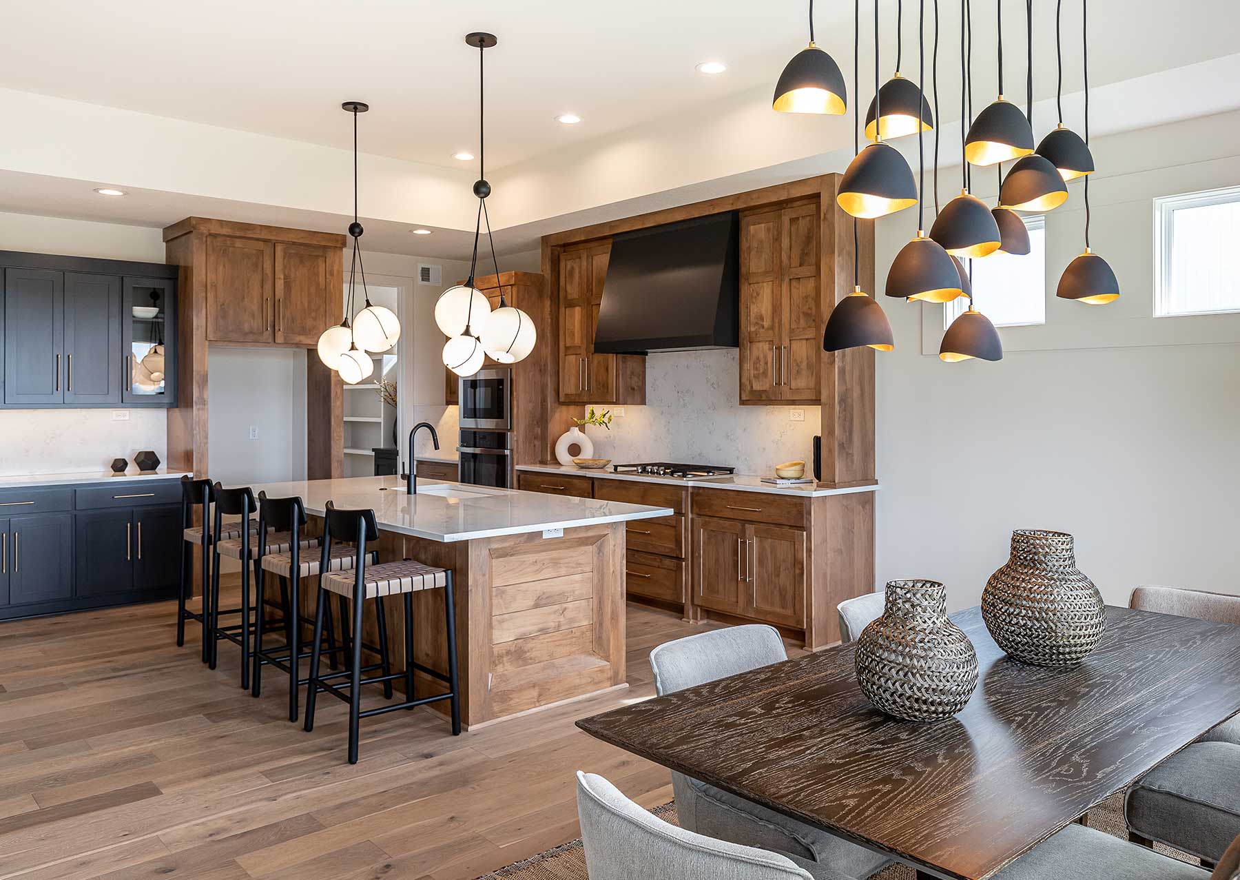
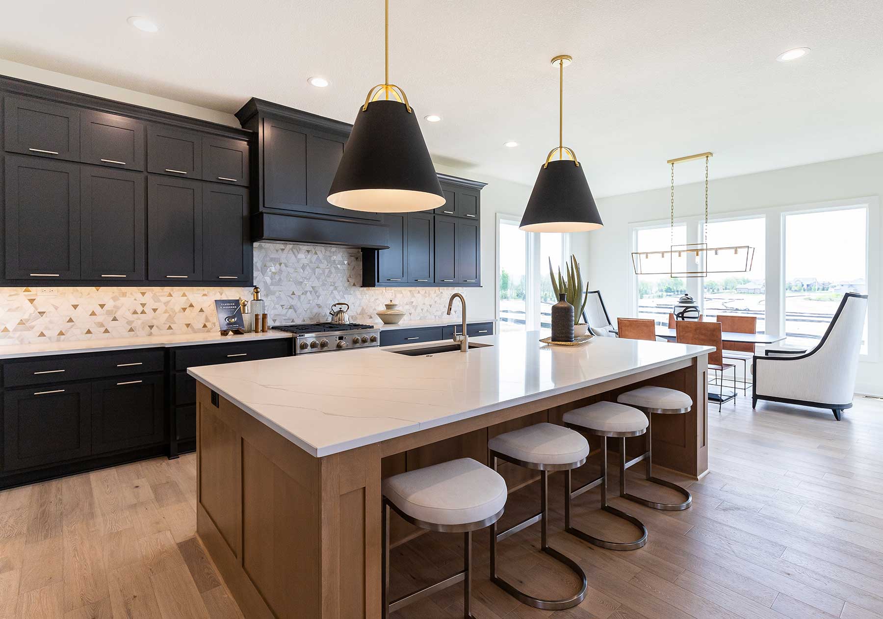
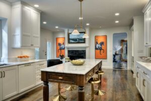
The main floor features dark Sherwin-Williams’ Iron Ore painted on doors, as well as the kitchen cabinets and island. 

“The size of the kitchen can handle it,” Molly notes. 

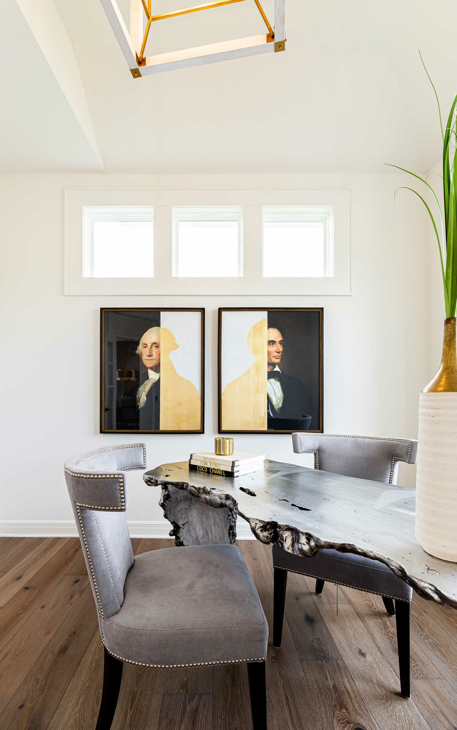
Paired with it is a patterned tile with glam metal accents along the perimeter wall. And the adjacent dining area is “a hot mix of everything,” Molly says. The tall-backed chairs, upholstered in white, are mostly a conversation piece—not entirely practical for real life but get you thinking outside the box. 

“When I found them, I had no idea where to use them, but in this way, they are unplanned pots of gold,” Molly says.

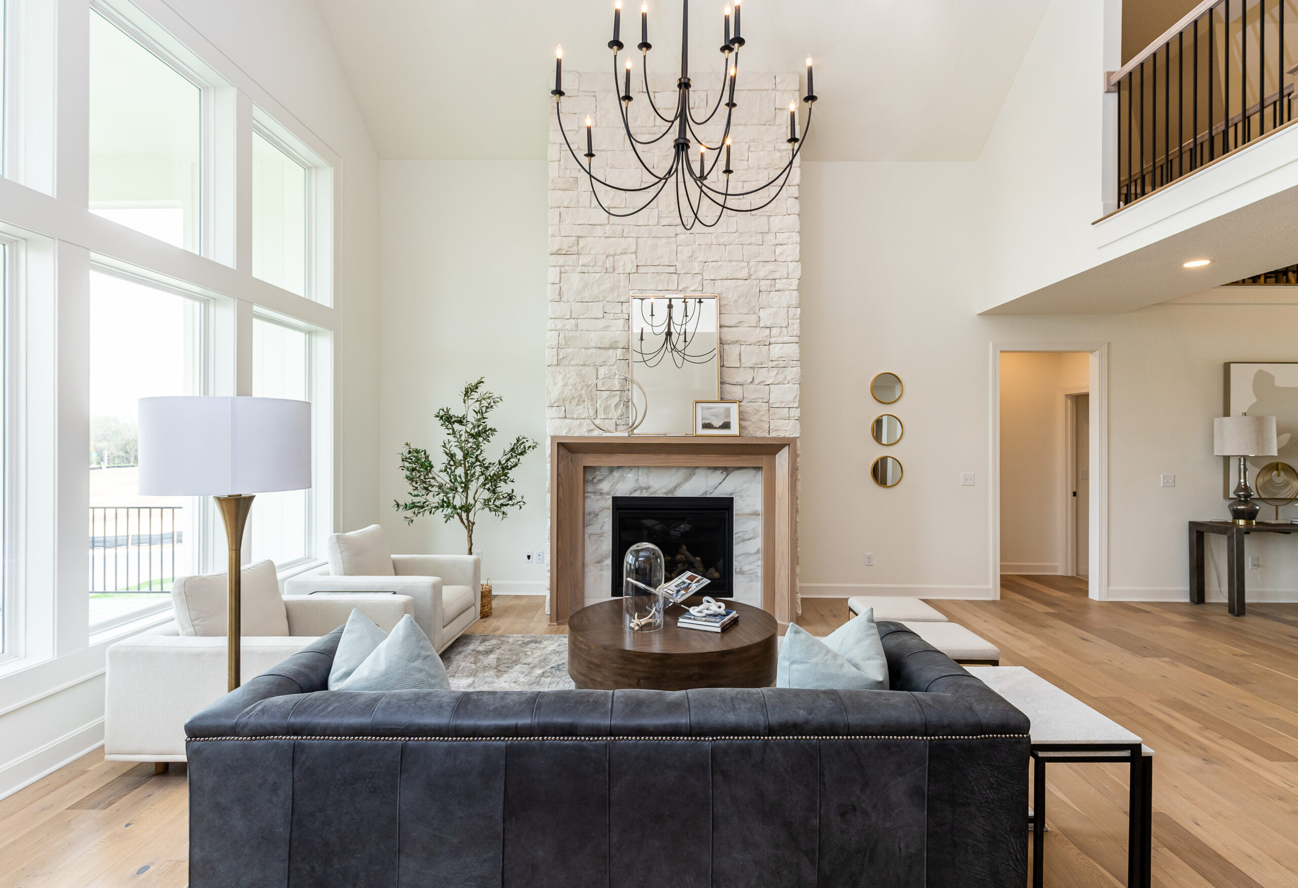
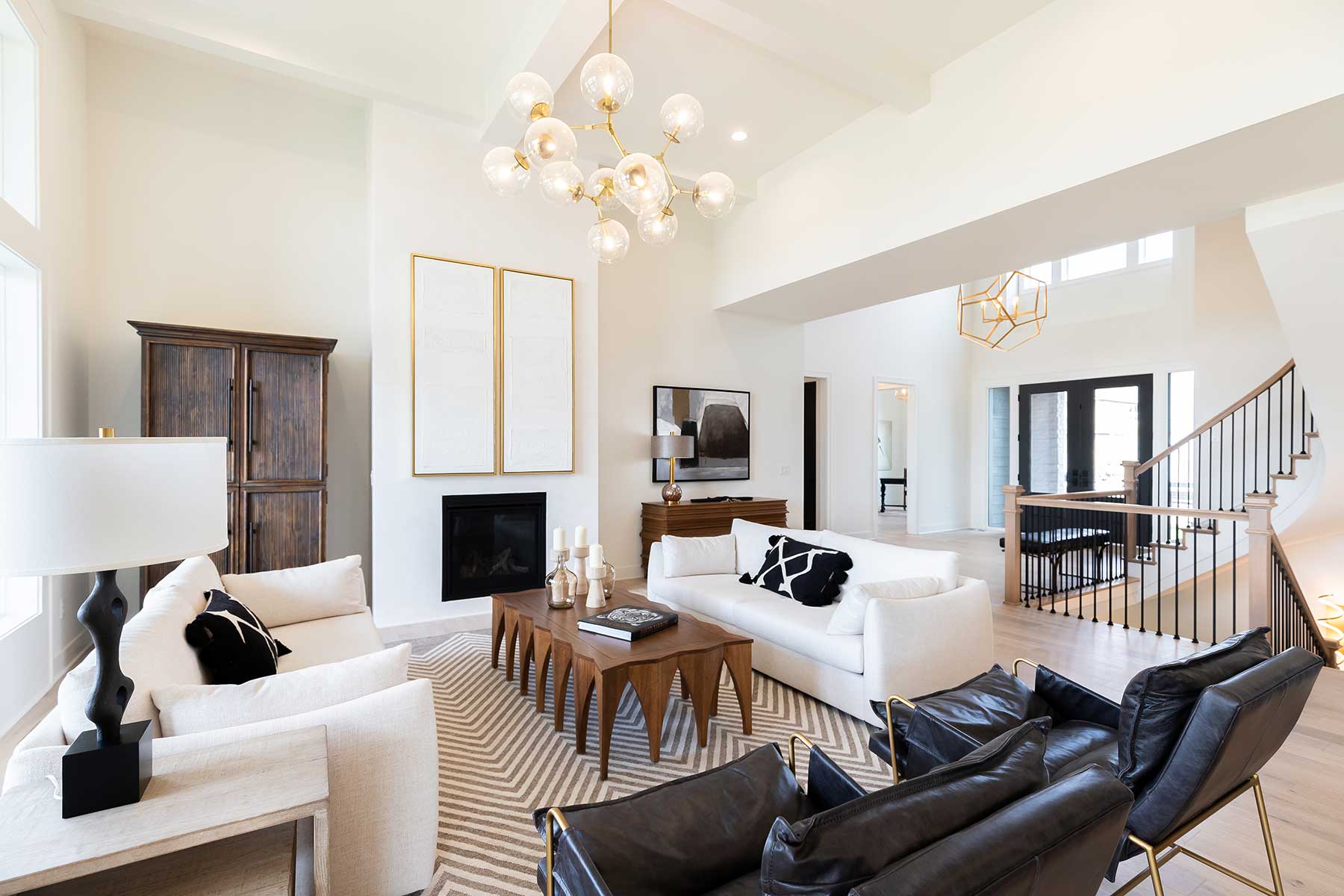
In the living room, soft white sofas contrast with low-profile black leather chairs and—notably—a ‘toothy’ wood coffee table, horizontal wood dresser and dark-stained tall media cabinet. The chunky quality of these wood pieces is vaguely reminiscent of furniture from the 1970s. The trio forms such an unexpected moment that is also comfortably familiar. 

Whereas the furniture, lighting and art are such standouts in the home, buyers might not notice the simple elegance of the wall texture on the fireplace: Venetian plaster. The trimless, matte texture recedes into the wall.  

“It’s California cool,” Molly describes. 

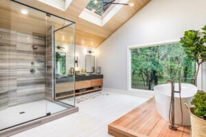
The same goes for the primary bathroom. When told the size of the shower, Molly knew she would need to meet it with something dramatic but not distracting from the other pieces in the space. The reeded tile she selected is neutral yet textured for interest and installed in a pattern. Glass doors allow the tile work to be prominently featured, and large mirrors above the vanity balance the gleam. 

“I would put that primary bathroom in my own house,” Molly says. 

Even the bedrooms upstairs continue the theme of organic textures and shapes, filling the rooms with interest while still showcasing the size of the rooms. 

A triptych of large-scale prints grounds the long hallway connecting the upstairs bedrooms. 

“The hall art was our biggest struggle because of the two-level entry,” says Molly, who tested three sets of art and mirrors before finding this collection from Soicher Marin. Library lights installed above each piece solidify the space intentionally.

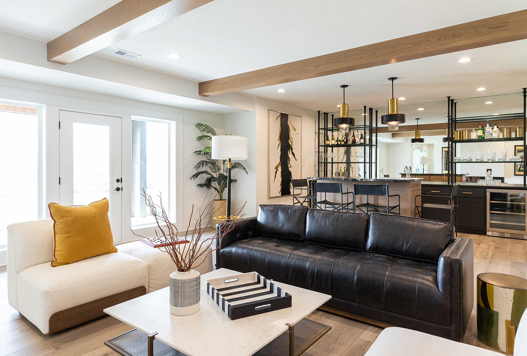
The lower level most definitively leans modern, styled with black iron shelves against a wall mirror that give the room major substance. Blue Valley school colors are brought into this level since Sundance Ridge will eventually be home to a brand new school in the development. Molly’s 14-year-old son created the artwork for the mural featured prominently in the rec area, which includes a ping-pong table and glass-enclosed exercise room behind a partition wall featuring a sleek fireplace insert. 

From top to bottom, The Providence steals scenes and sets the stage for a family that lives large and loves to have fun. 


Connect on Instagram
@laughlindesignhouse

Classic

Traditional selections with Transitional touches create ‘updated timelessness’ at this model home.

Design by Megan Gensky Interiors

The New Haven is one of Rodrock Homes’ best tried-and-true floor plans. The open and airy two-story living room and entry are grounded by scaled-down ceiling heights in the kitchen and adjacent dining room, which is crowned by a barrel vault. One of the plan’s best attributes is the sitting room tucked around the corner, filled with natural light and its own fireplace. 

The flexibility of the space could be interpreted in a number of ways, but designer Megan Mosier of Megan Gensky Interiors crafted her own design blend for it at Sundance Ridge’s Red Fox Run. 

Megan was one of four interior designers selected to take a home on Model Row to showcase different design styles. Her given style evolved from Modern Farmhouse to a more classical look. 

“I didn’t want to go super far with that original theme,” Megan says. “There are elements of farmhouse style, but it’s more like New Traditional with Transitional vibes. It has nice, clean lines and a neutral palette with lots of textures.”

Ship lap is a sure sign of farmhouse style, so Megan incorporated it—in one place only and installed vertically rather than horizontally—in the sitting room.

“It draws the eye up and has a more modern look,” she explains.

Tasked with creating a wow feature for the house, Megan focused on the living room’s two-story stone fireplace. A minimalistic marble tile surround and wood mantle complement the almost-white color of the stone. 

Megan used the same wood seen on the mantle as she did on the vent hood in the nearby kitchen. The wood band adds warmth to the soft gray cabinets. Honed granite countertops, which have a matte texture, are one way Megan used soft touches to add interest, while the backsplash’s handmade ceramic tile looks wavy and glossy. 

“I mixed natural elements for depth,” Megan says. 

Mixed metals—including brushed gold and polished nickel—add a little pop. There’s also a touch of black in the living room fixture. 

“You can’t go wrong with black, but it can get too matchy-matchy or look flat if you use too much,” Megan says.

Black and white tiles show up on the primary suite’s bathroom floor, where they make a timeless pairing. Penny tile used on the shower floor is another time-tested selection. 

Trimwork is a classic treatment that Megan used on the stairwell wall; here, the square wainscoting is highlighted by shaded sconces and artwork of a pastel-painted landscape. 

“I am a person who loves lighting,” Megan says. “It adds a lot to a space, in terms of ambiance and decoration.”

She adores the entry chandelier—a large-scale asymmetrical fixture in stark white that reads both modern and traditional.

“It makes its own statement,” Megan says. 

Throughout the house, details like these are layered and never in your face. On its journey of design evolution, it became a tasteful blend of comfort and luxury.


Connect on Instagram
@megangenskyinteriors

You may also like these articles.

Leave a Reply

Your email address will not be published. Required fields are marked *