
Fall 2023
Eurostar


Karin Ross: Custom Remodeling with a European Flair
Karin Ross spaces are designed to tell a story about her clients, their lifestyle and their needs.

MOJO Built: Building Modern Homes in Harmony with Historic Neighborhoods
Many people love the mature trees and charming characteristics of older homes in the close-in neighborhoods of Prairie Village, Old Leawood, Fairway, Mission Hills and Brookside. But houses designed in the 1940s and 50s don’t always suit the way families live in their homes today.
Your dream home starts with Pella windows and doors
Replacing old or inefficient windows and doors is a great way to increase energy efficiency, as well as modernizing your home’s look and style.

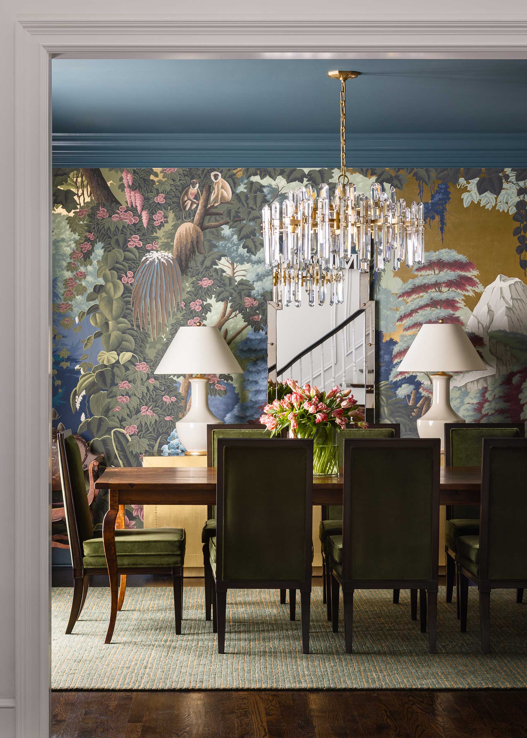
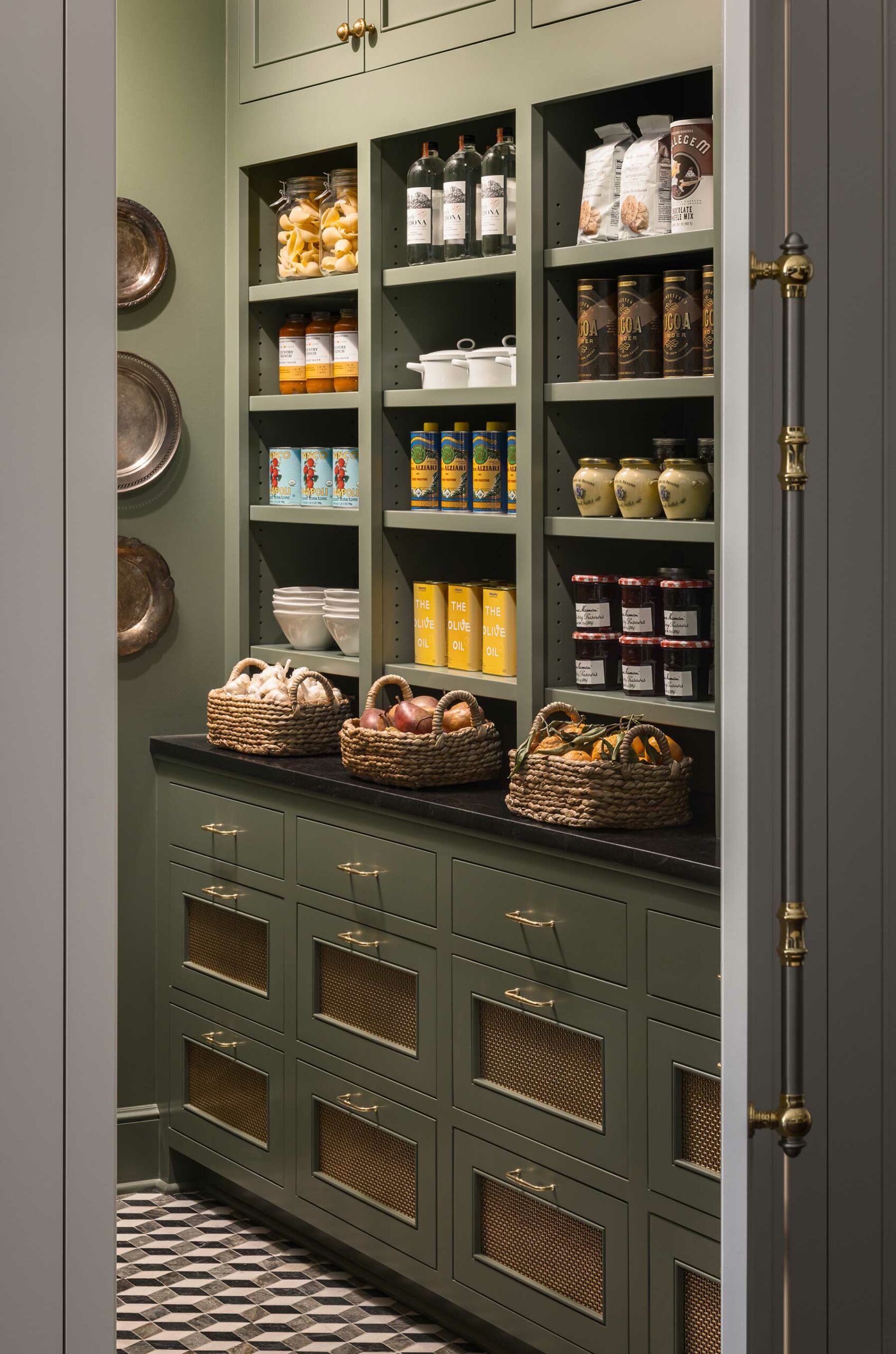
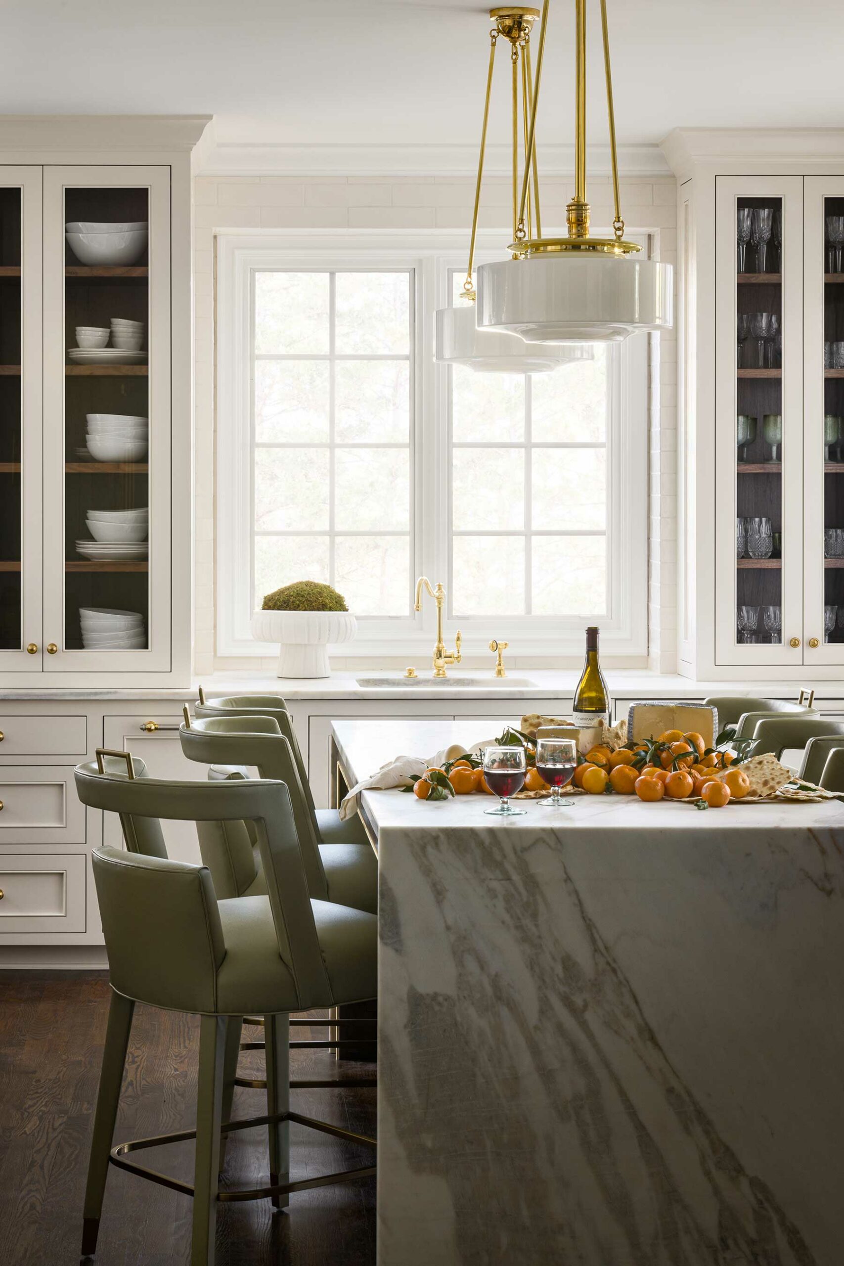
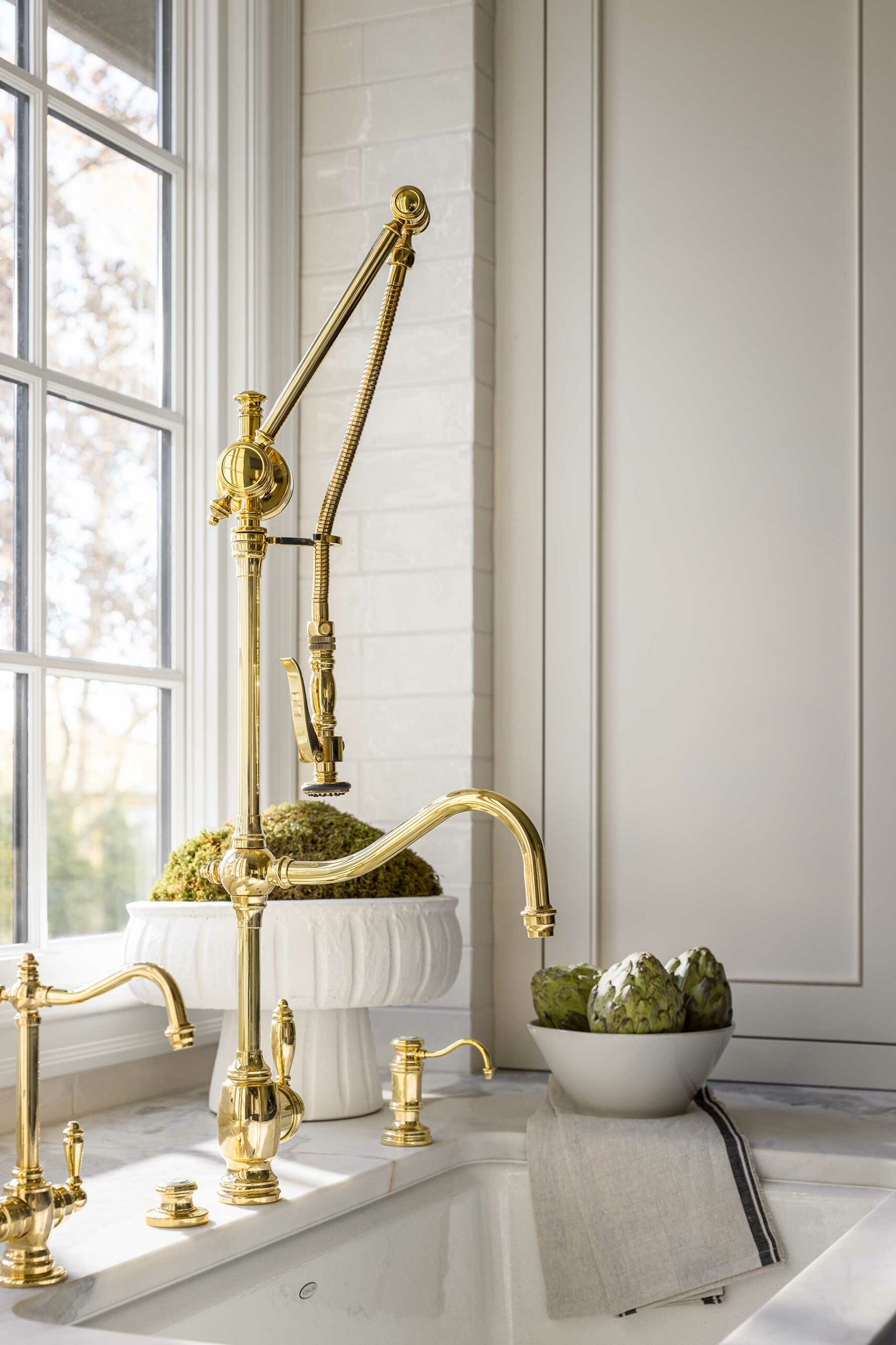
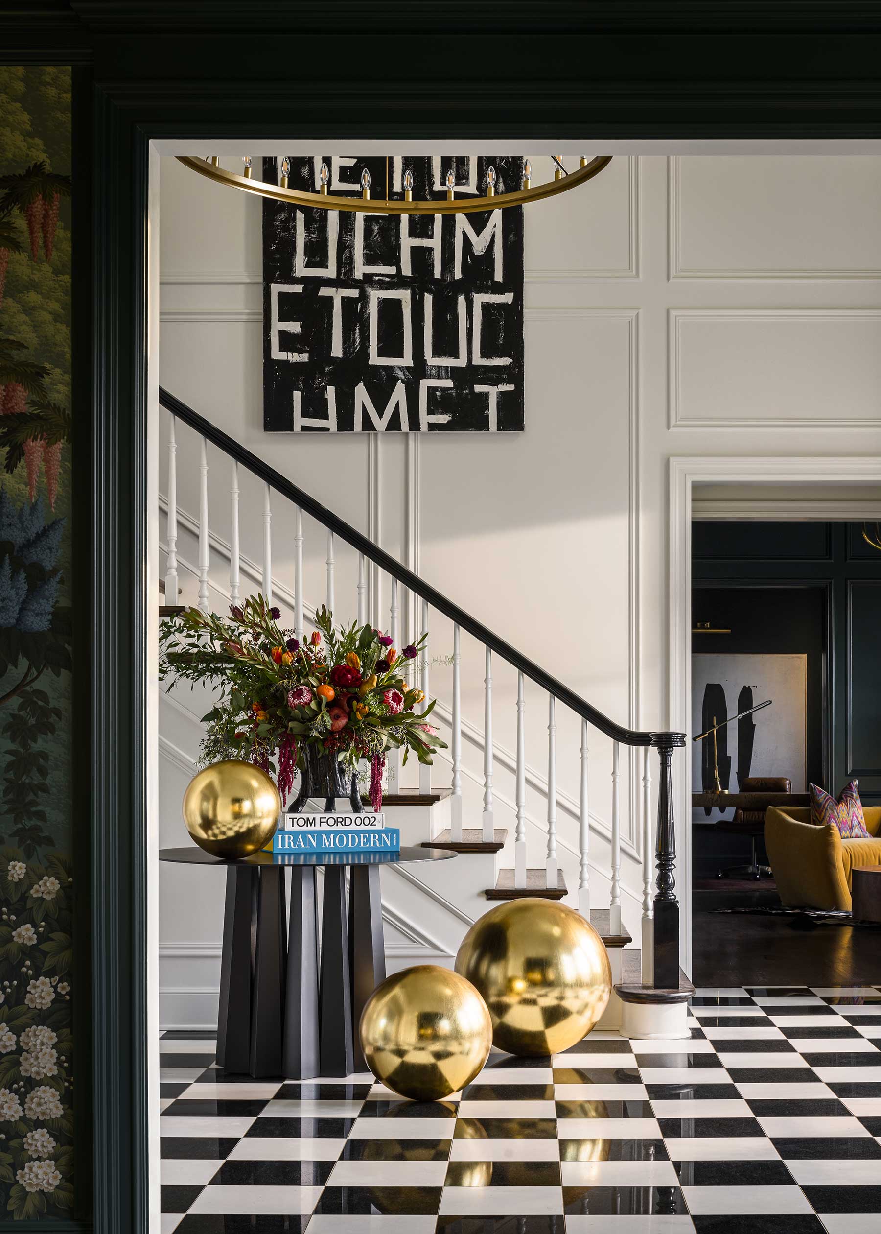
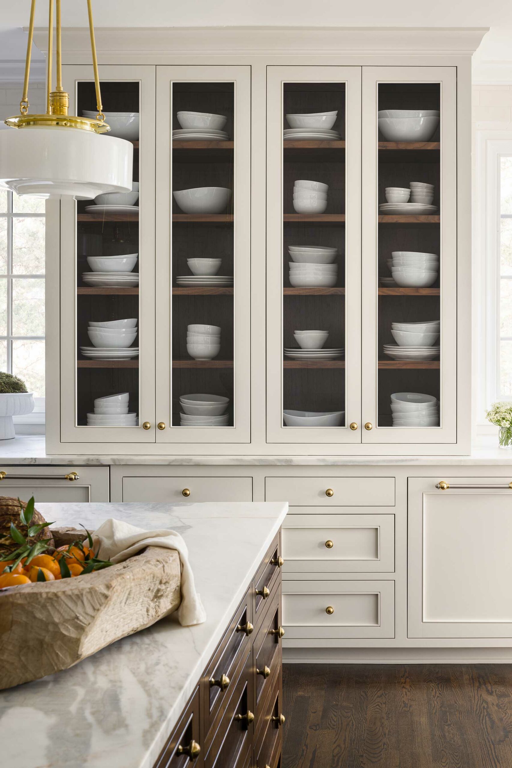
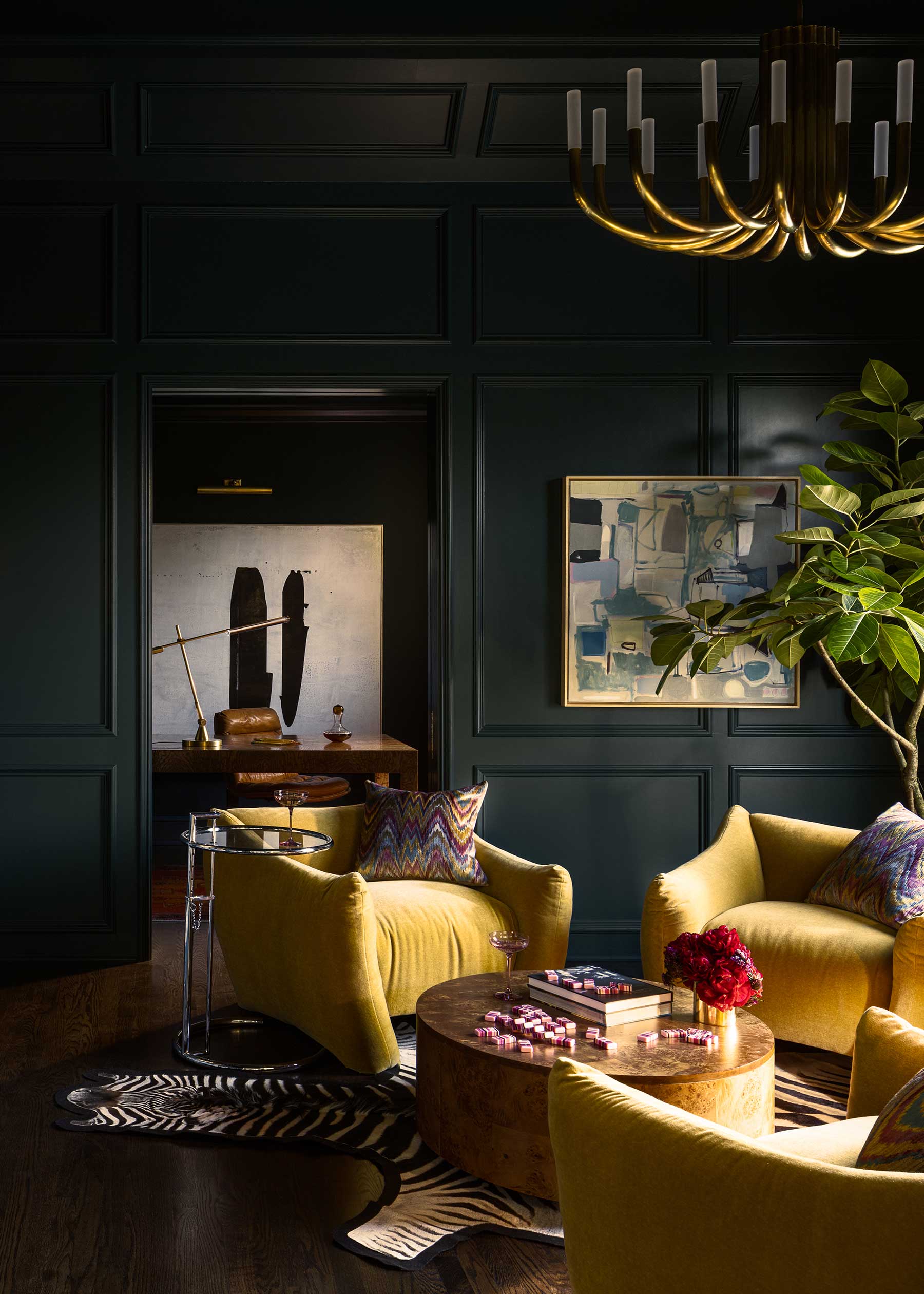
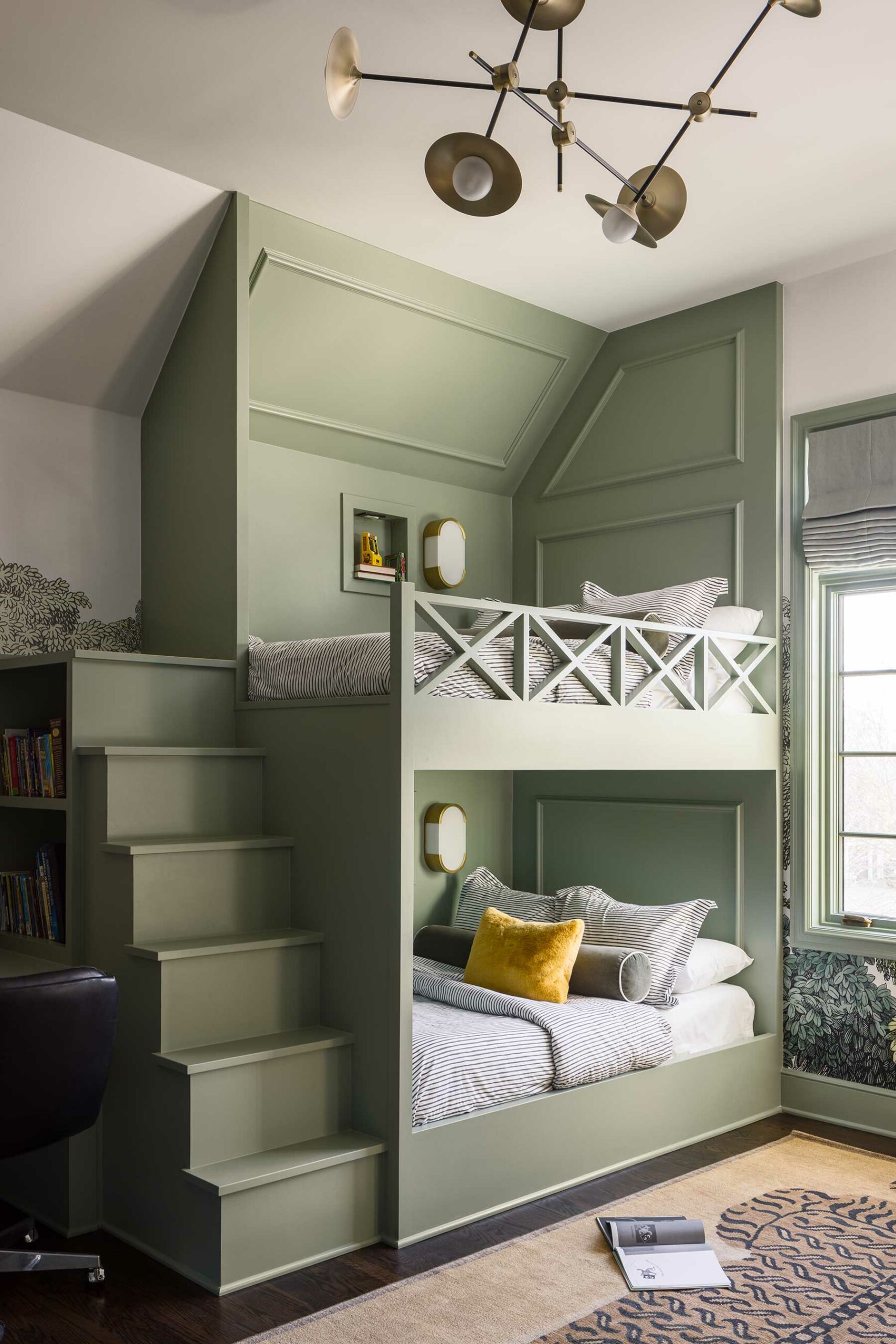
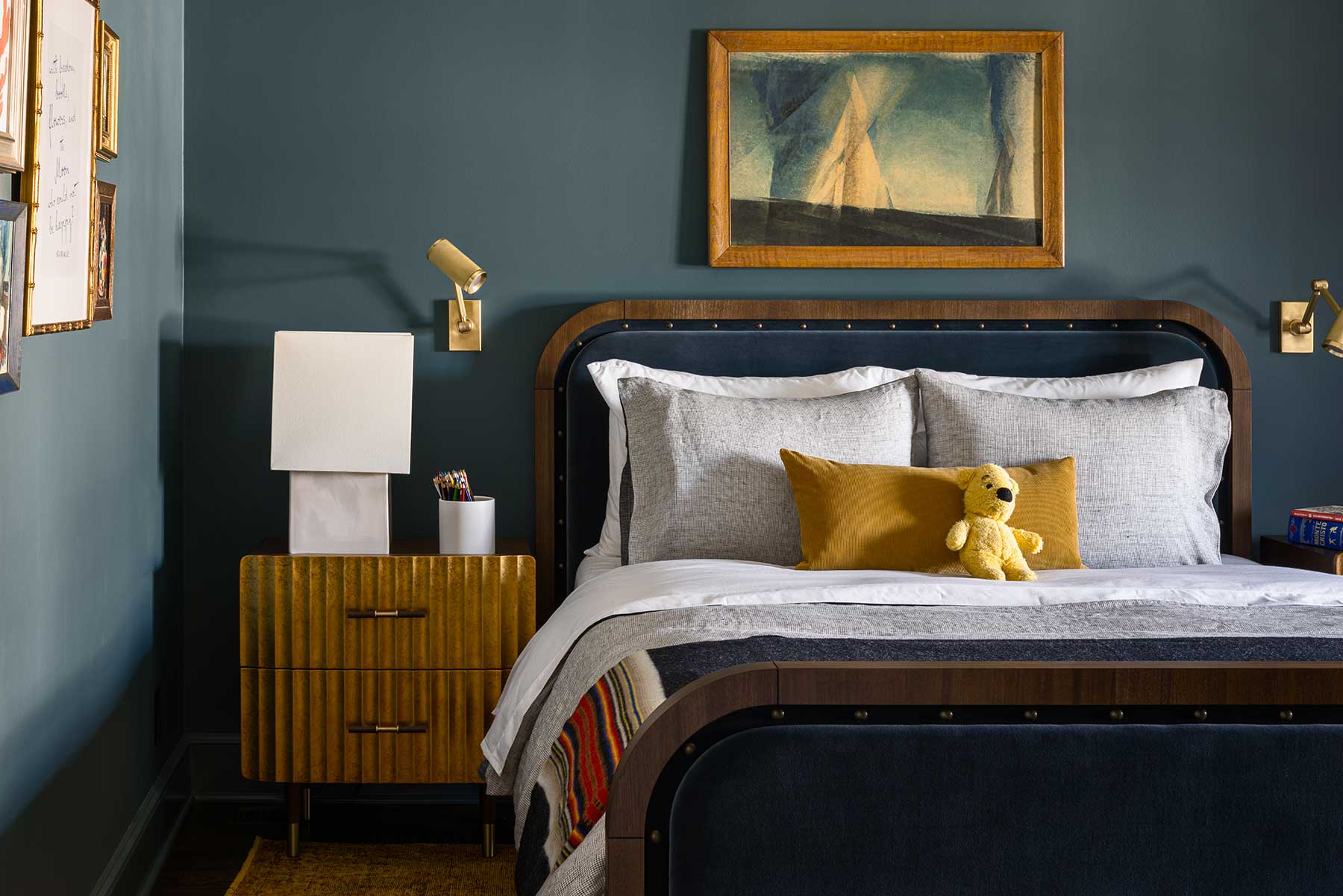
French Bistro at Home
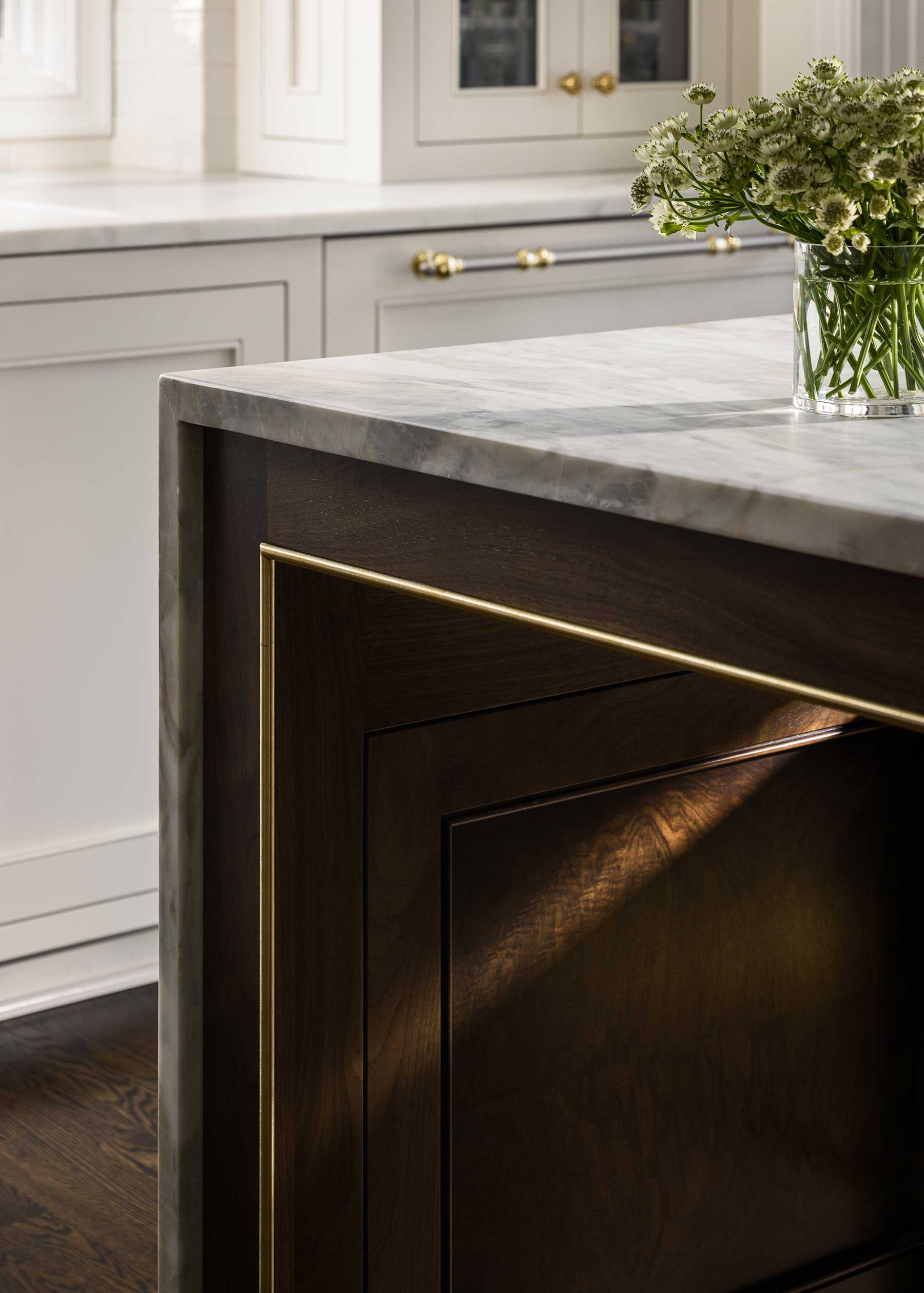
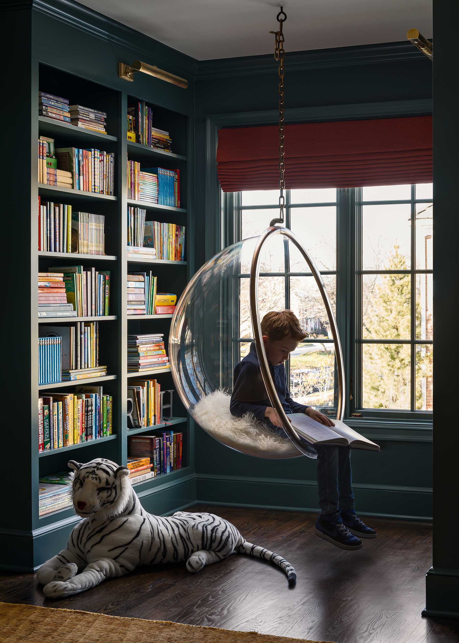
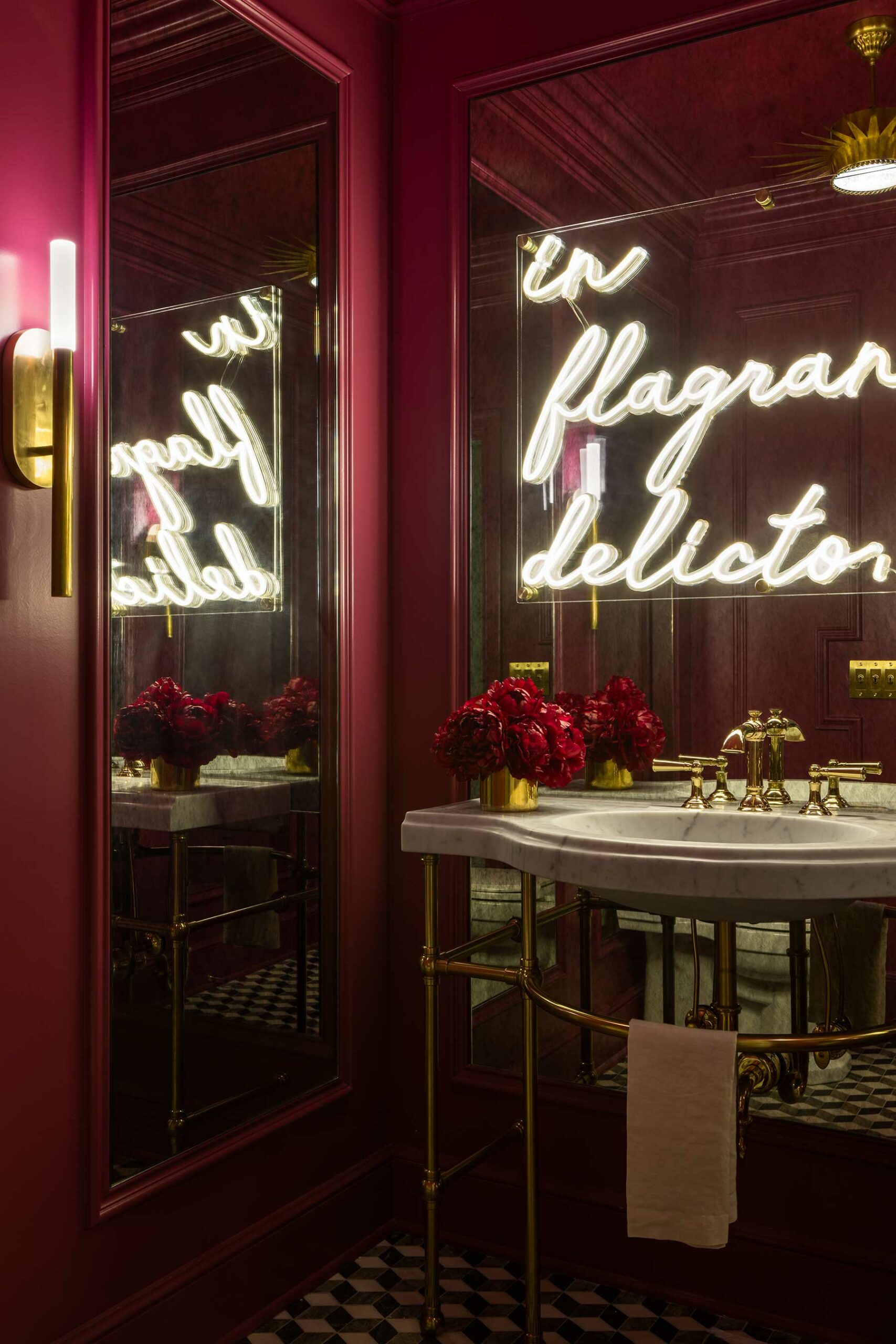
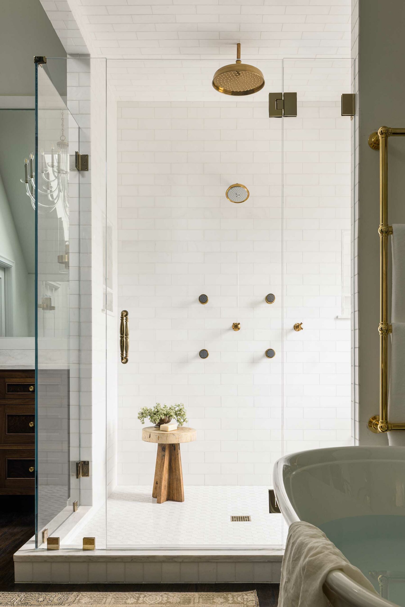
Delicious curves, dramatic contrasts and gleaming golds accentuate a renovation project in Kearney that’s dually functional and opulent.


Walls of Renaissance
Wallcovering trends showcase bespoke styles, vibrant hues and textured expressions.
Leave a Reply