Words by Lisa Waterman Gray | Photos by Brynn Burns
Nine florists interpret the art of Heather L. Lowe in floral arrangement.
esplendent in a bright pink jacket, painter Heather L. Lowe greeted guests at “Art of the Arrangement II”—Leawood Fine Art’s April exhibit that invited visitors to a competition wherein local floral designers created naturally beautiful arrangements to complement Heather’s work as an internationally renowned contemporary artist. Heather’s goal with this competition was to stimulate community collaboration while illuminating Kansas Citians’ creativity. A graduate of the Gemological Institute of America in Carlsbad, California, Heather’s creative works reflect her longstanding love for and knowledge of minerals and gemstones, and she often infuses her paints with these crystalline materials. Her new art includes pieces from her series, The Secret Life of Colour. The overall collection primarily features contemporary nautical works, mixed media and some prints. “Each florist had a team to create and design their installations that interpret a piece of artwork assigned to them this year,” Heather says. Gallery visitors submitted votes for their favorite arrangements and an esteemed panel of judges scored each florist’s use of space, concept and aesthetic value.
Instagram @ leawoodfineart
Instagram @ elementcstudio
Second Runner-Up
Ascension of Color/ Blooming Through Concrete
Vertical pigment strokes and an almost watery foreground characterize Ascension of Color, encouraging viewers to consider the work of light and color in this painting. Negative space is challenging, too, as is ascension of any kind. Created by Elle Dillon Flowers, Blooming Through Concrete incorporates a sculptural open palm to symbolize an open mind. To maintain continuity with the painting, she also hand-tinted plumosa fern in nine different tones. A custom metal sculpture anchors the arrangement, which stands amid a pile of rocks, with grapevine woven throughout the piece.
Instagram @elledillonflowers
Parchment/Almost Like Rain
Paint is the subject of this enriched oil work. For Parchment, the artist used encaustic wax paint and technique to layer, cover and highlight the paint, allowing for visual fading and dimension within the piece. Floral colors in Almost Like Rain, by Lily Floral Designs, echo colors in this painting, which appear to ascend down the piece, almost like rain.
Instagram @lilyfloraldesignskc
Magenta Gardens/Untitled
Magenta Gardens features red and fuchsia tones, with deep green accents across companion oil paintings on corkboards. It’s a riff off the idea that a garden can be large, such as Madison Square Garden, with the softness of the foreground allowing the work to be simultaneously loud and silent. Untitled by Village Flower Company incorporated only things that were already in the shop—like recycled or repurposed items—to be more sustainable, including dried materials and repurposed orchid plants.
Instagram @villageflowercompany
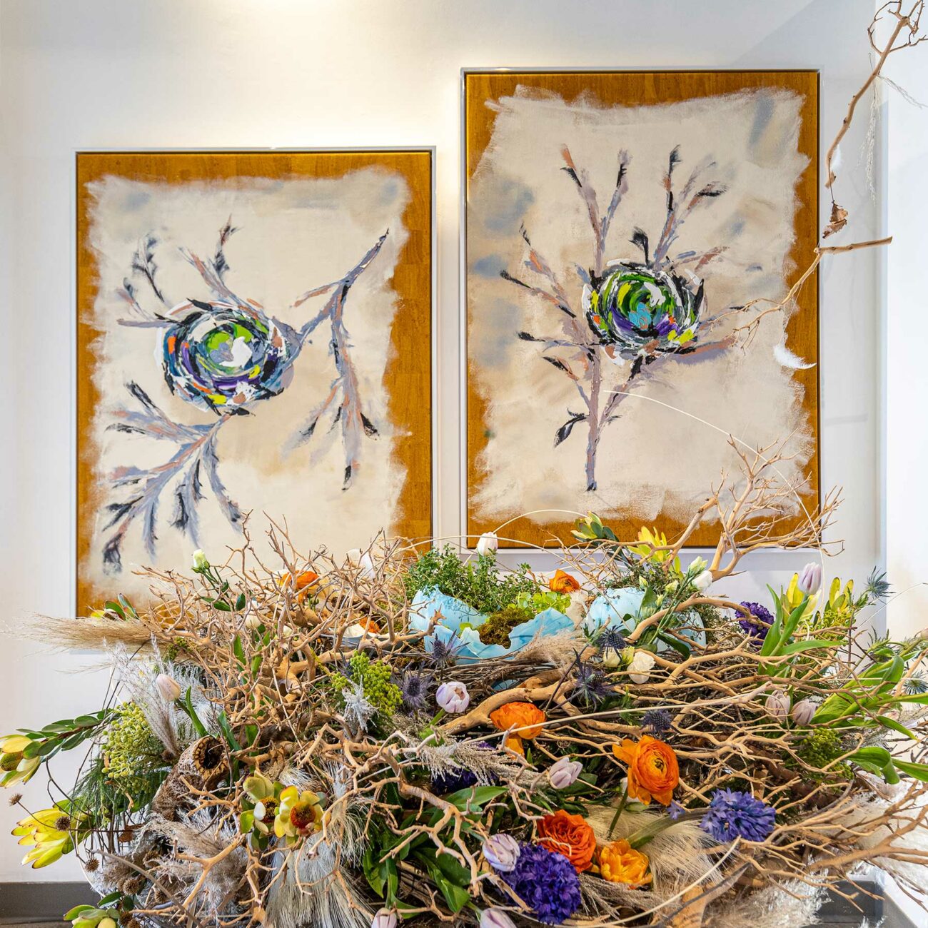
Blue Nestr/Force of Nature
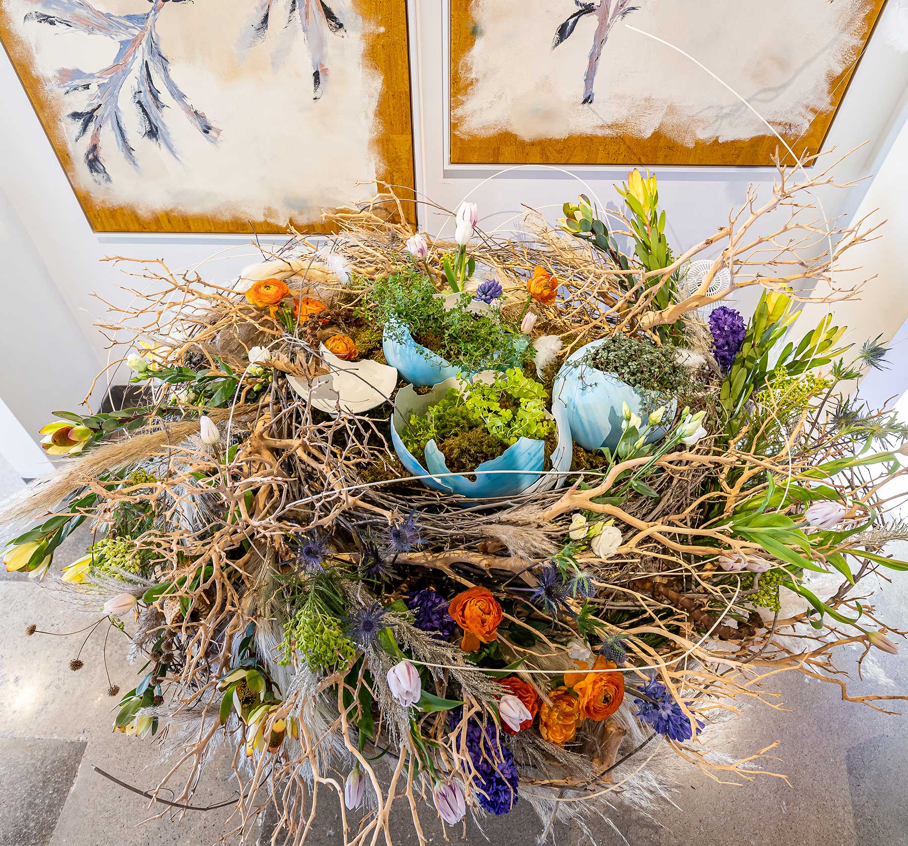
The Blue Nestr duo pays homage to our human habit of building nests for comfort and safety. Displaying an irregular ‘border’ of unpainted cork, the paintings depict blue eggs inside a multi-colored nest atop pale gray branches. Full of brilliant-hued flowers, the nest-like Force of Nature arrangement by Branches & Twigs echoes materials that birds utilize. Freshly hatched faux eggs—displaying baby green sprouts—are designed to represent life’s fragility, amid manzanita branches, thistle, tulips, roses, ranunculus, berzilla berries, bleached grasses, hyacinth, protea and fragrant thyme.
Instagram @branchesandtwigs
First Place
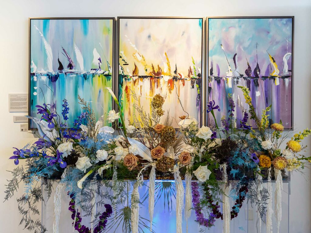
The Ballad of the Boats/The Ballad of the Boats
A triptych, The Ballad of the Boats, was painted to create a team of images dancing to some vibration and song from long ago. Eden Floral and Events’ The Ballad of the Boats floral arrangement filled a wall-mounted planter box with riotous color, reflecting the trio’s vibrant palette and composition. It incorporated white and toffee-colored roses to budding white calla lilies and stems of deep blue irises. Palm fronds, curly willow, reindeer moss and dried palm fronds add height and interest.
Instagram @edenfloralandevents
Alloy/Alchemy
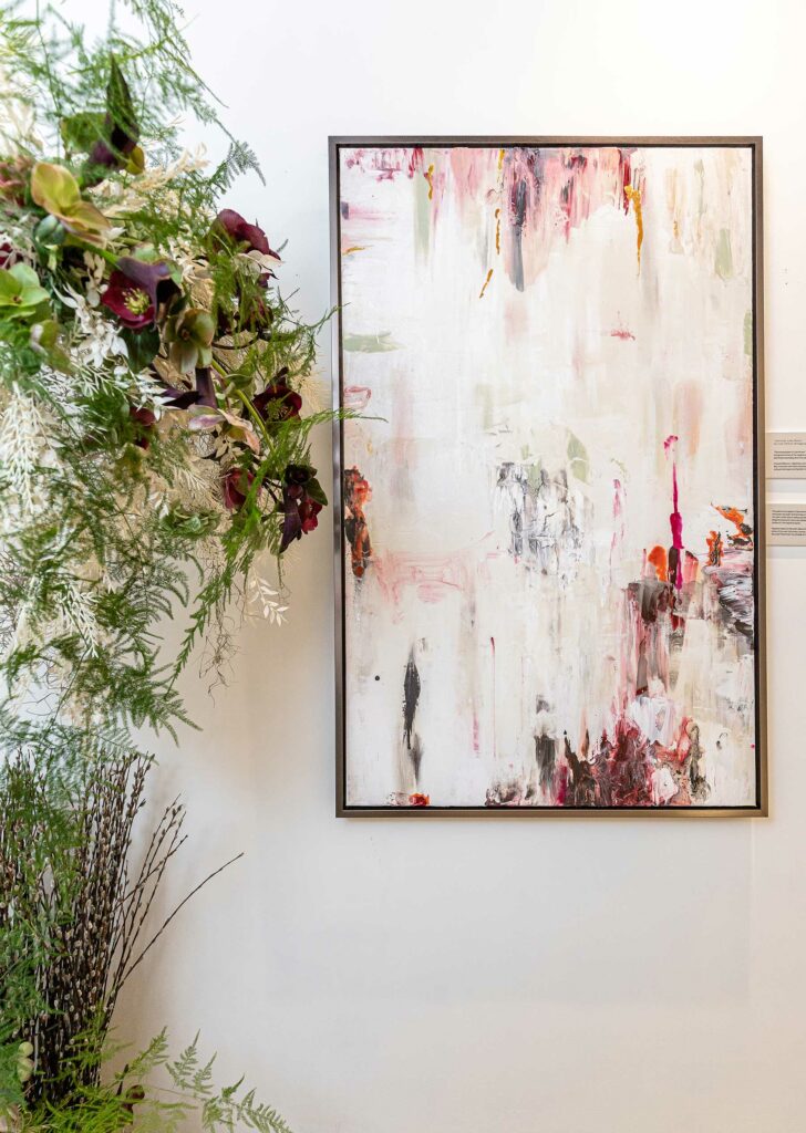
Crafted with oil paint on Portuguese cork, Alloy is part of a series about McCreedy Mine in Ontario, Canada. Pink, red, gray, black and pale green tones add interest with translucent color punctuating a white background. Created to complement this piece, Alchemy, by Thorne Floral, represents the magical process of transforming one type of matter into another—and an effort to turn the artist’s original work into something new, using carnations to dried calla lillies and marigolds, suspended behind clusters of looped bear grass.
Instagram @thorne.floral
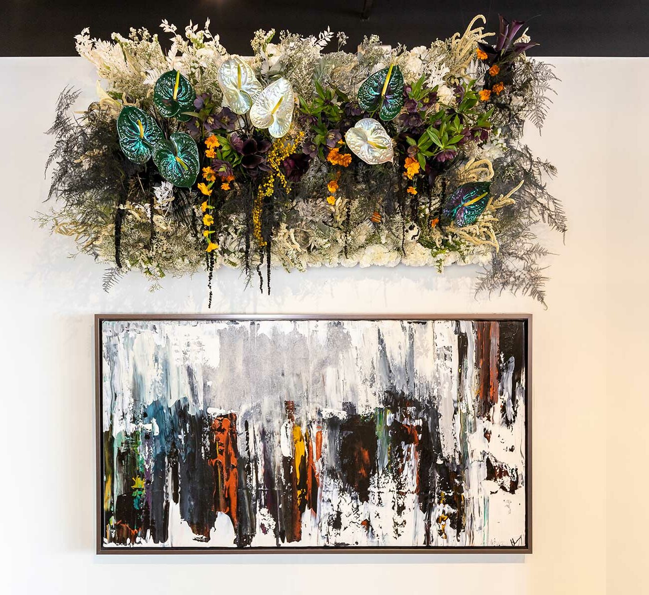
Pre-Chaos/In Case of Chaos, Break To Breathe
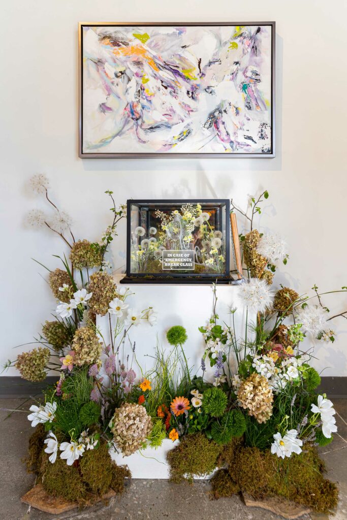
Full of colorful paint strewn across a white and pale gray background, Heather’s fun and energetic Pre-Chaos painting was created to demonstrate finding calm amid chaos. With its In Case of Chaos, Break To Breathe arrangement, Floral Frontier used dandelions, various types of grasses, hydrangea, lavender and columbines to demonstrate the harmonic powers of flowers, all while encouraging viewers to stop, breathe and center.
Instagram @thefloralfrontier
First Runner-Up
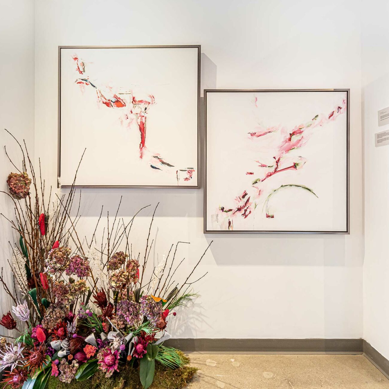
Pawnee II/Reflection of Pawnee
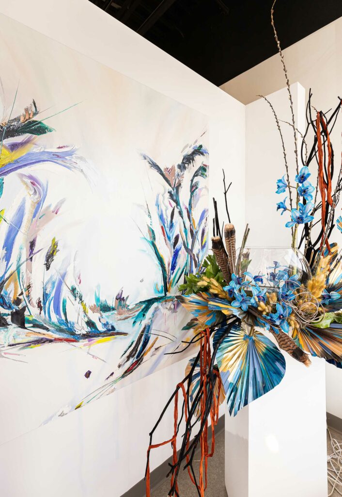
Heather utilized her palette knife skills to create a work suggestive of the headdress and organic appearance that Native Americans used during sacred ceremonies. Moved by the painting’s interesting lines, movement and play on color, Sidelines Custom Floral created Reflection of Pawnee. The floral piece incorporates cymbidium orchids alongside dried hand-painted palm leaves, tall pussy willow branches and hawk feathers. (Pawnee I is in a private collection in Kansas City.)
Instagram @heysidelines
Best Use of Space
Birmingham Shipyard/ From a Spark
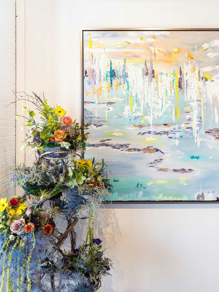
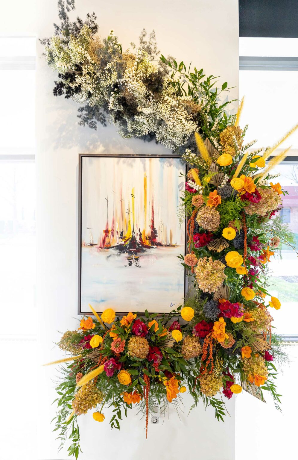
With its immense congestion of color, turn-of-the-century England’s rough and often corrupt ports inspired Heather’s Birmingham Shipyard painting. And color was the biggest inspiration when creating this floral installation. A massive ‘bouquet’ hugs the bottom and right edges of this painting before curving toward the ceiling and dissolving into a wispy collection of white flowers and greenery. Created by Cole Scott of Flowers by Emily, this companion piece, From a Spark, incorporates red, yellow and orange blooms that mirror the piece’s palette while complementing blue and dusky water and sky.
Instagram @flowersbyemily
You may also like these articles.

Karin Ross: Custom Remodeling with a European Flair
Karin Ross spaces are designed to tell a story about her clients, their lifestyle and their needs.

MOJO Built: Building Modern Homes in Harmony with Historic Neighborhoods
Many people love the mature trees and charming characteristics of older homes in the close-in neighborhoods of Prairie Village, Old Leawood, Fairway, Mission Hills and Brookside. But houses designed in the 1940s and 50s don’t always suit the way families live in their homes today.

Your dream home starts with Pella windows and doors
Replacing old or inefficient windows and doors is a great way to increase energy efficiency, as well as modernizing your home’s look and style.

French Bistro at Home
Delicious curves, dramatic contrasts and gleaming golds accentuate a renovation project in Kearney that’s dually functional and opulent.

Walls of Renaissance
Wallcovering trends showcase bespoke styles, vibrant hues and textured expressions.




Leave a Reply