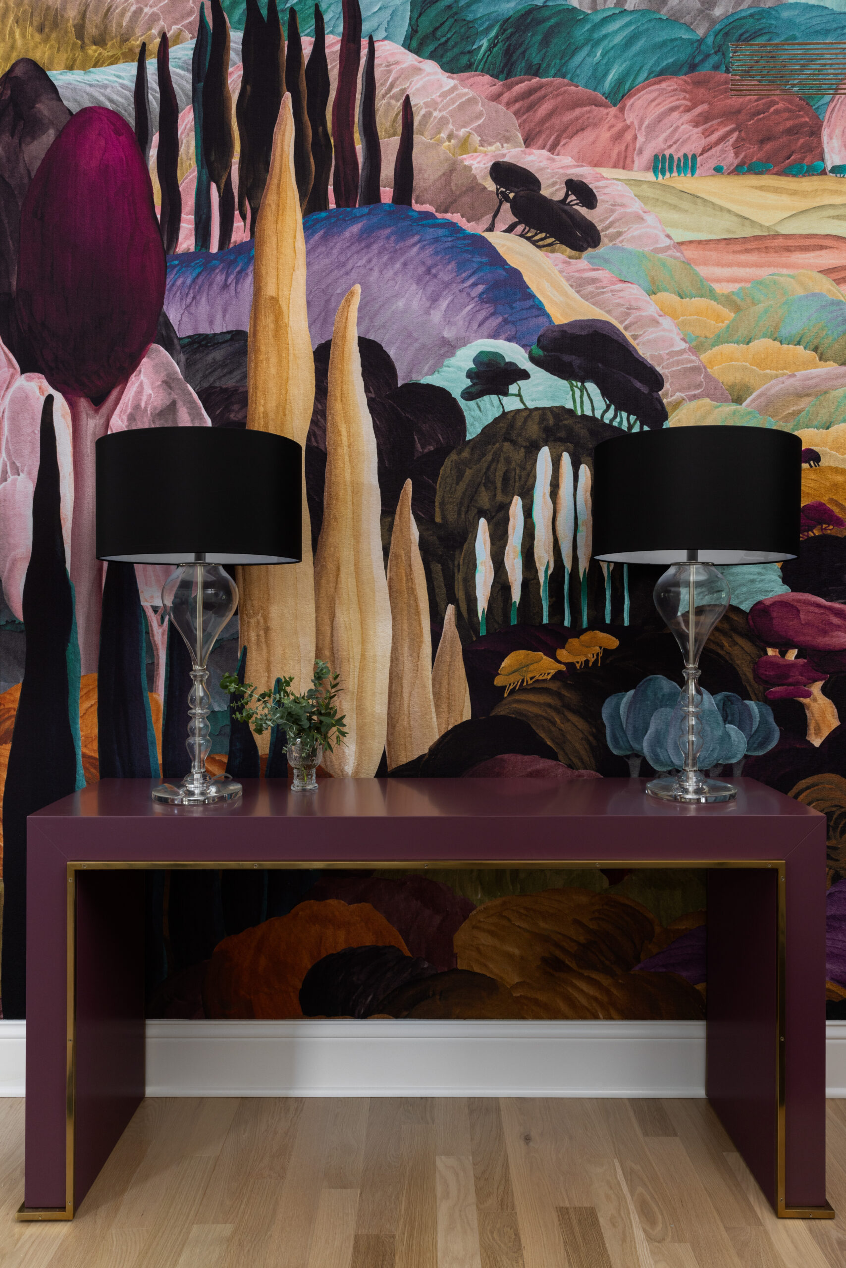
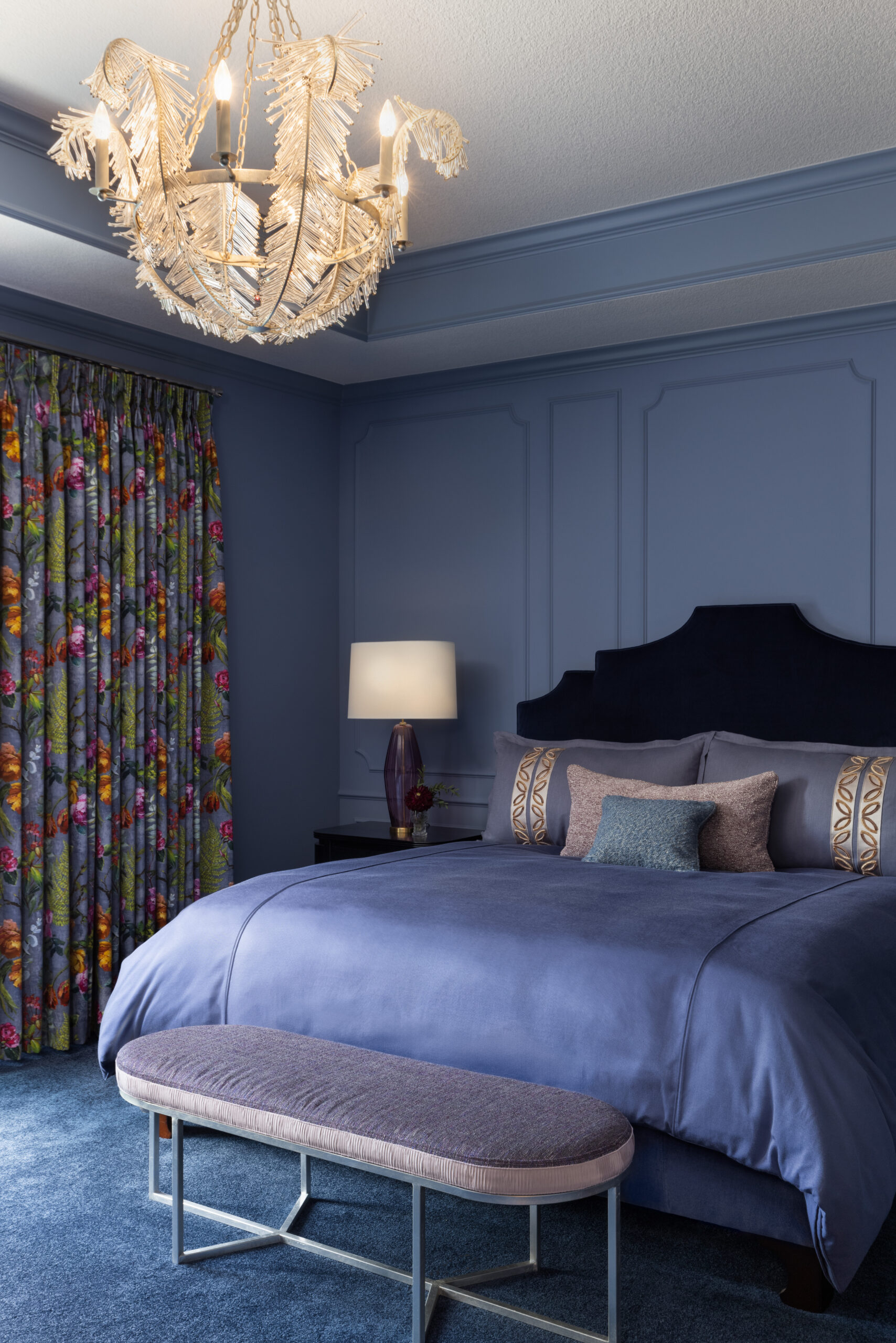
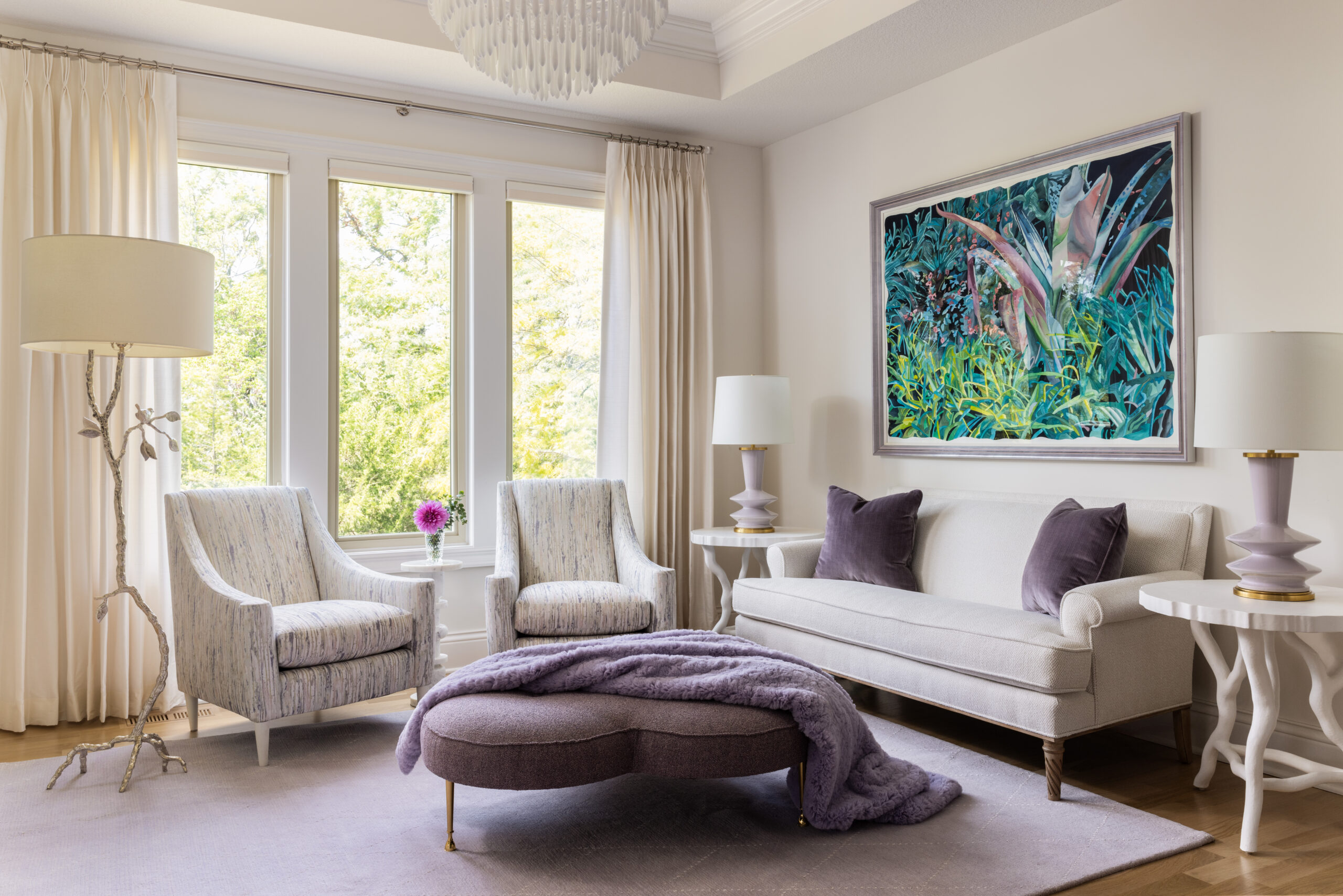
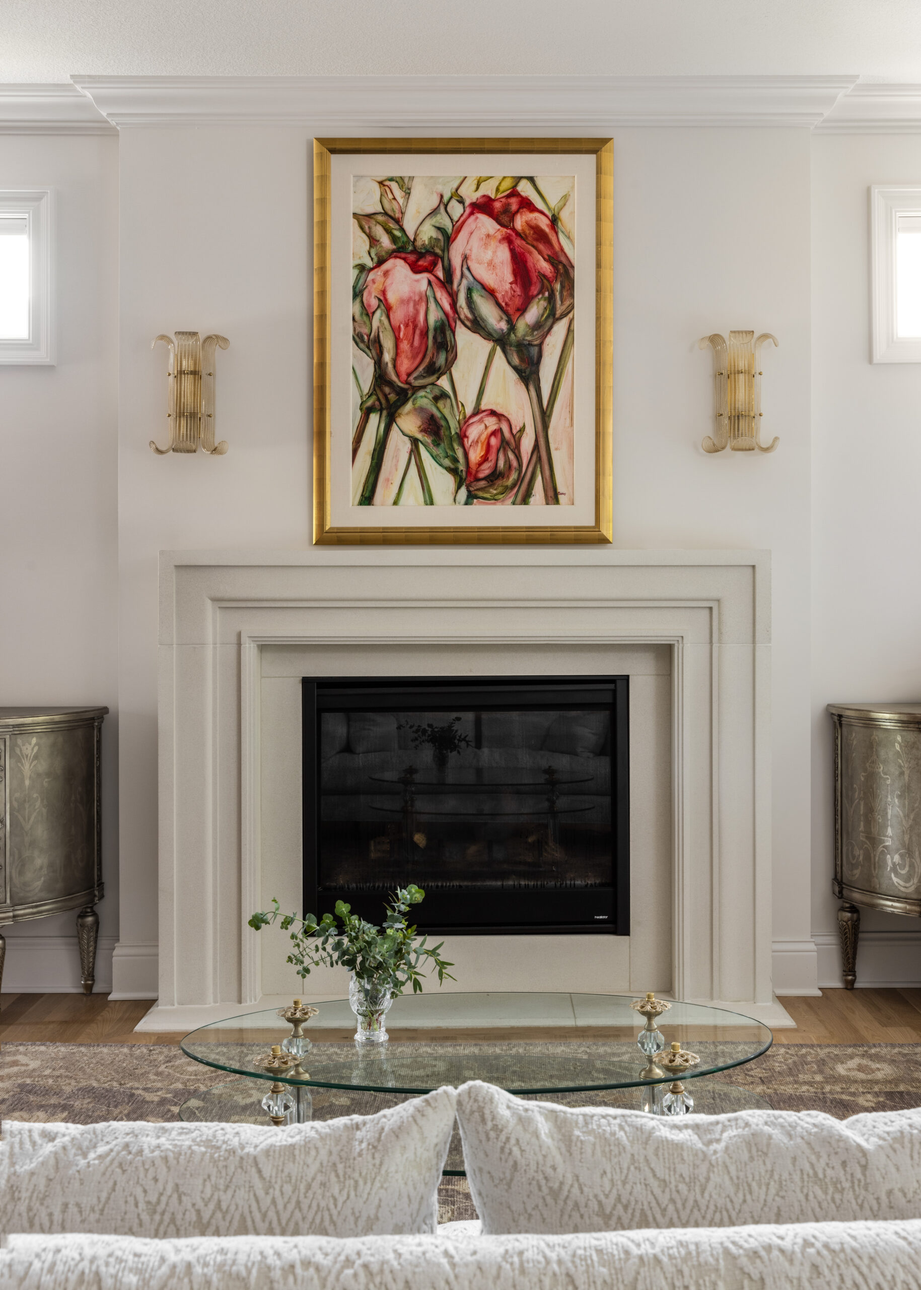
If incorporating color feels daunting, Jill and Patrice have a few helpful guidelines. First, if you want to go bold, go all in. Fully commit to anchoring elements. Rather than tossing in a few colorful pillows, choose a substantial piece of furniture to be the fulcrum for the rest of the design, or—as is the case with this home—an exciting choice of purple glass tile.
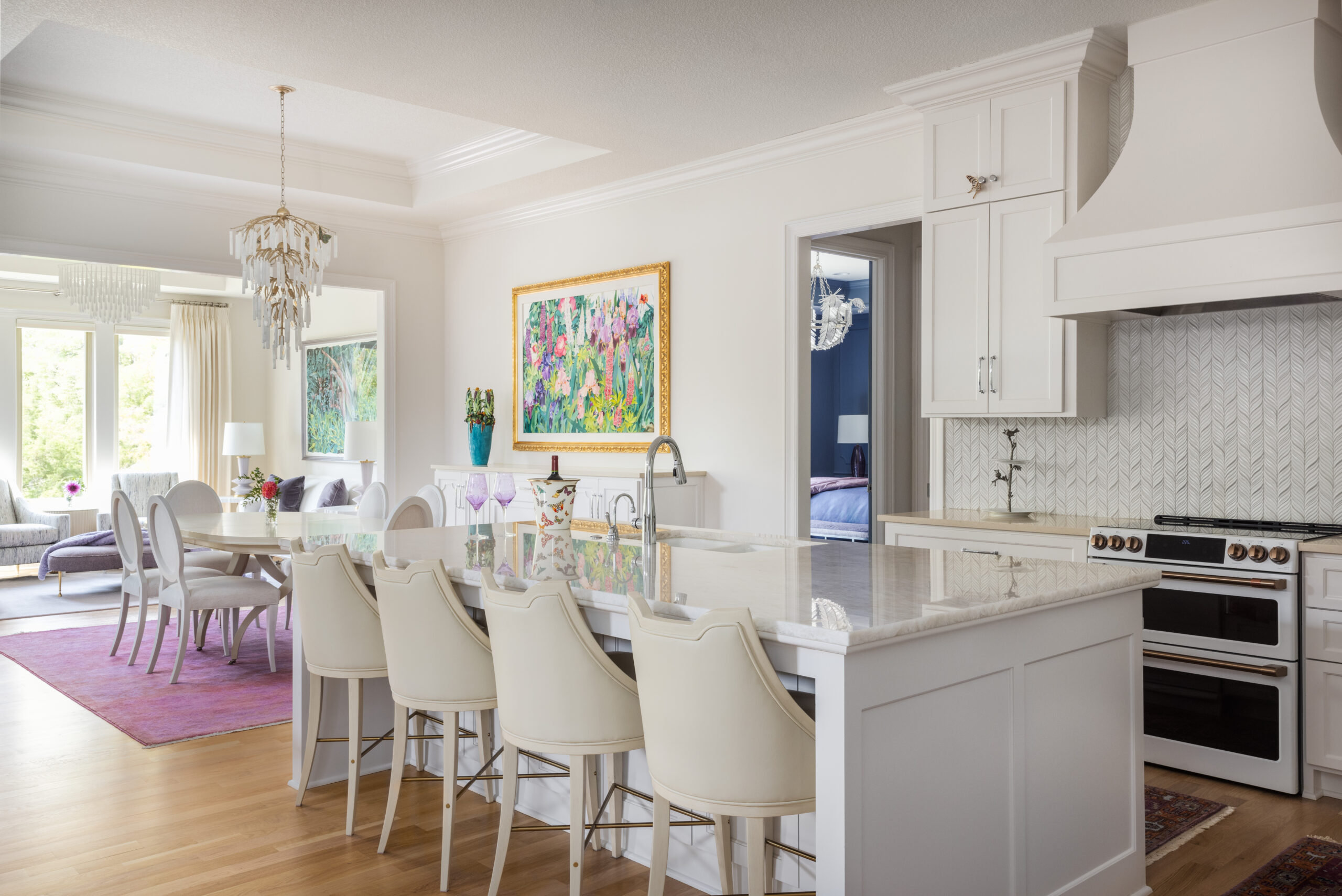
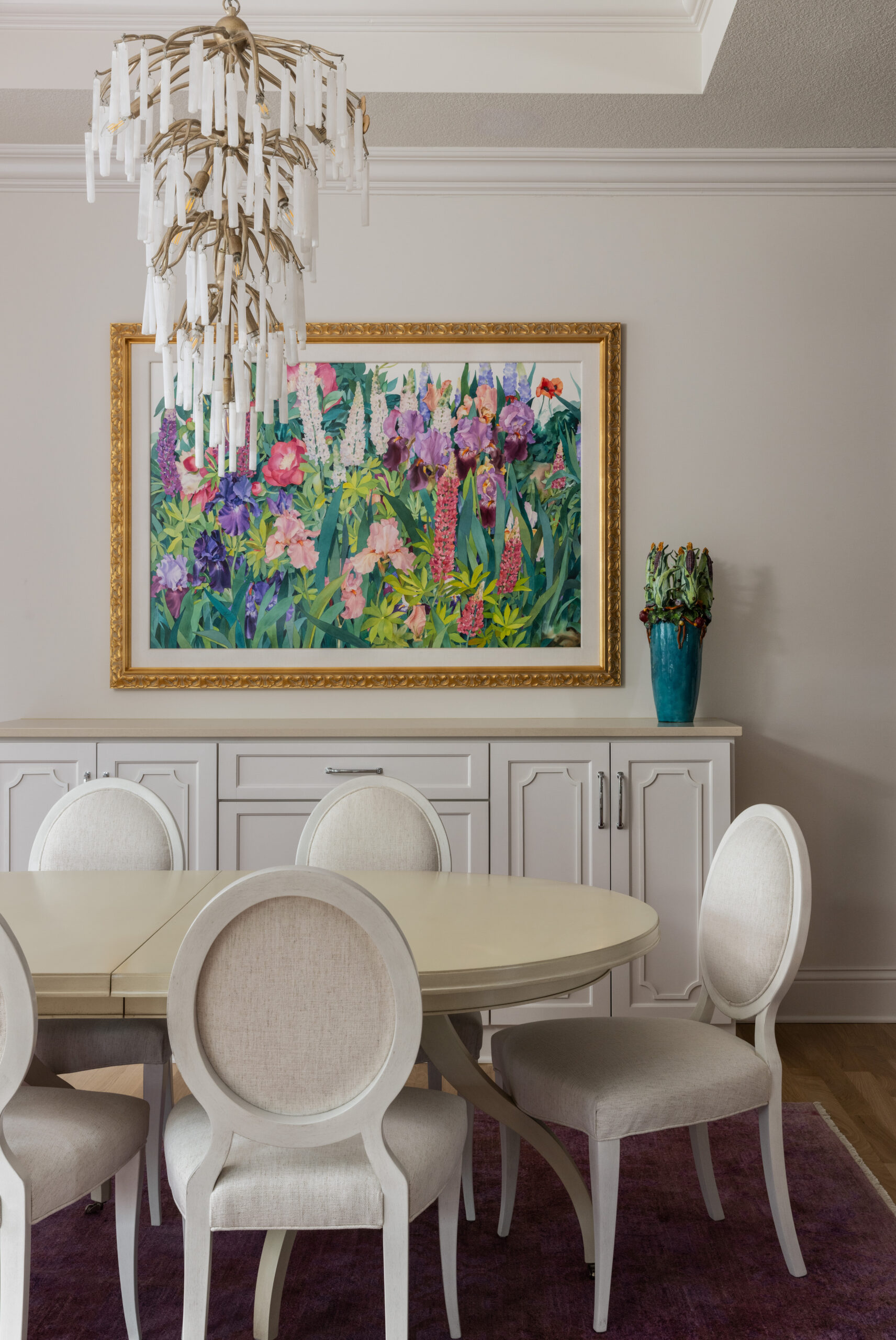
“From the very beginning when pulling fabrics, paint chips and furniture pieces, we had that lavender glass tile that the homeowner loved in mind,” Patrice explains. “She’d also come into the studio and describe their amazing art collection to us. It was important that we honor the artwork, honor the colors that were in the artwork, and that every element works together seamlessly.”
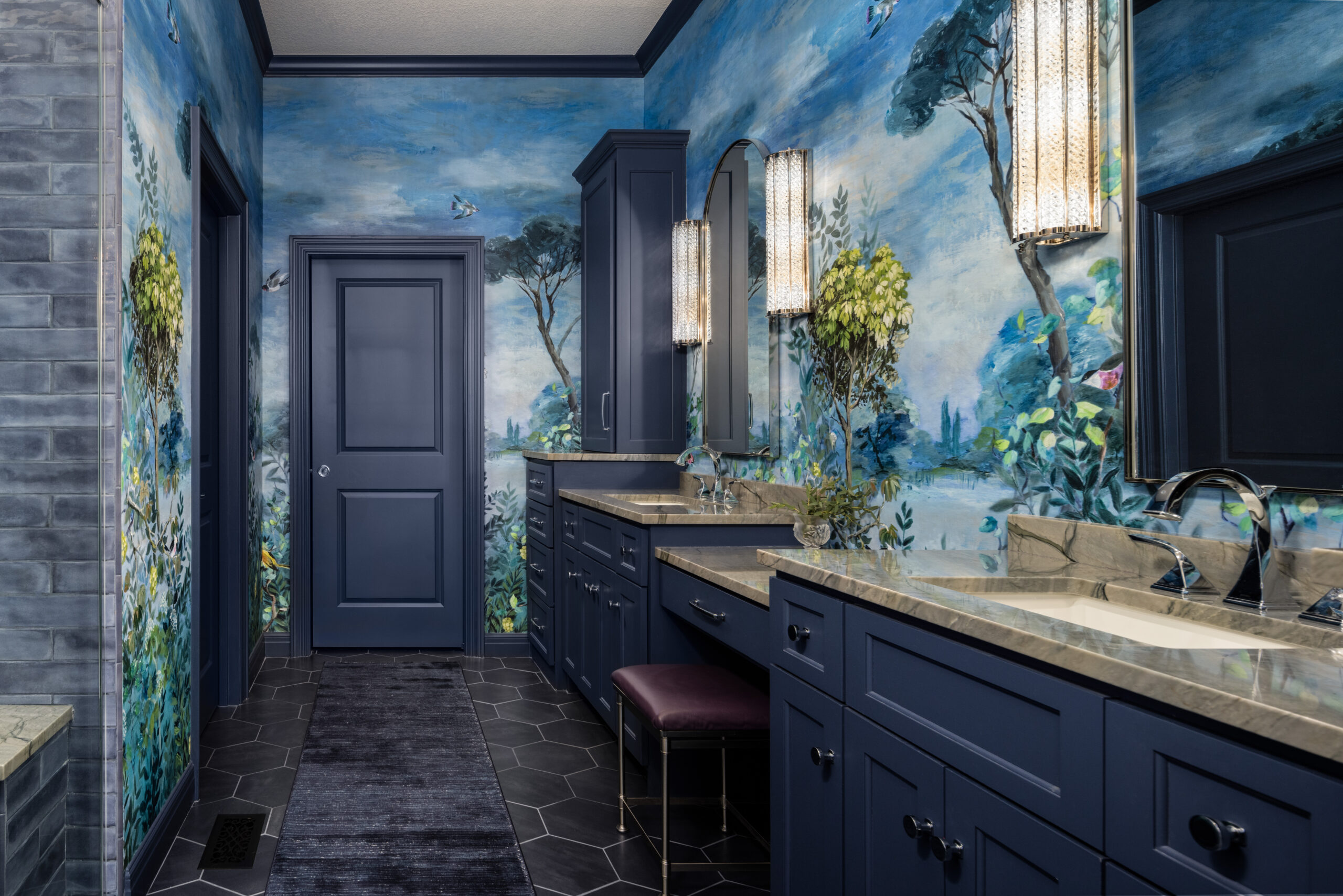
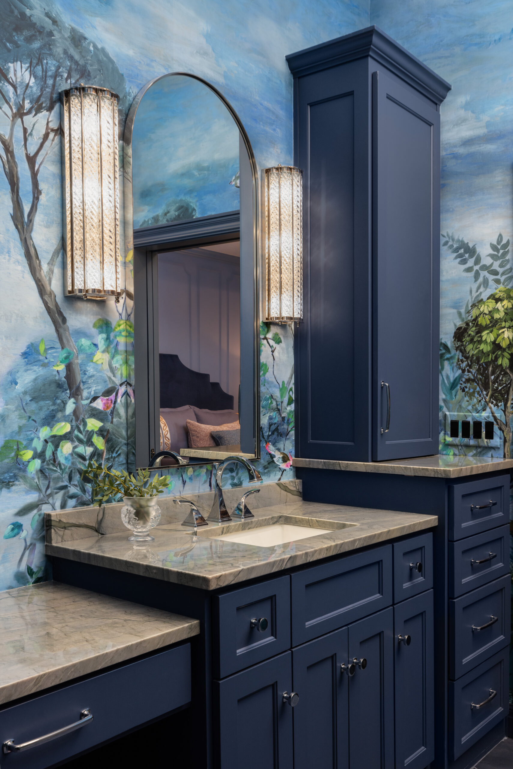
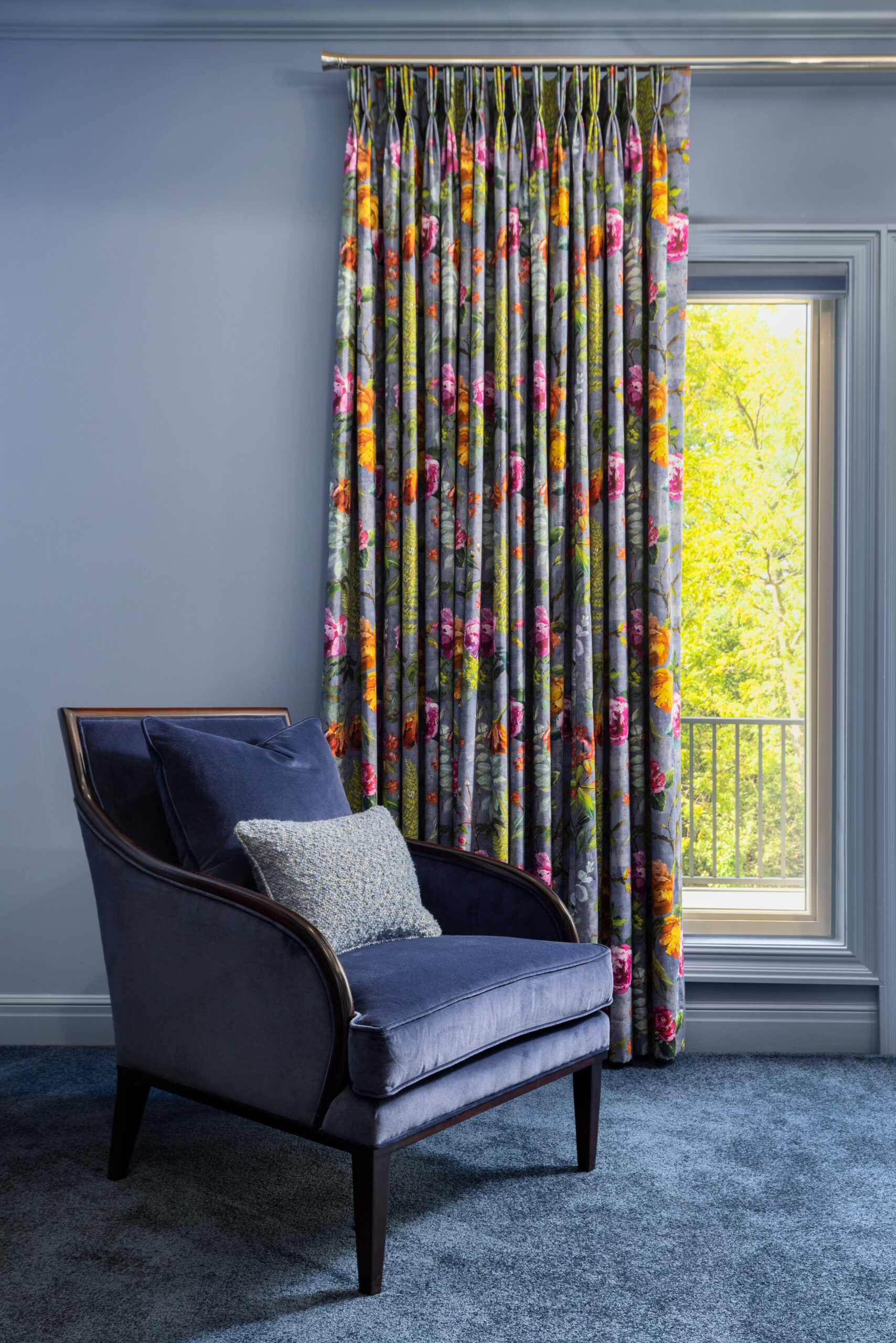
Another way to infuse bold color is to implement various intensities of the same hue. Jill and Patrice relied on this technique especially in the primary bedroom, where a monochromatic play on cornflower blue is as soothing as it is sophisticated.
Finally, if you long for color but need help getting started, choose a designer you trust who will take the time to get to know you.
“We have a gentle process to get emotional reactions,” Jill says. “We hang on every word and really watch their body language. Design is all in the eye of the beholder. It’s emotion. It’s past life experiences. We want to discover what makes them feel amazing and what rocks their soul.”
Patrice adds, “This homeowner really trusted us. She would come to the studio so excited for the presentations to see all the fabrics and all the textures and paint colors…Just delightful to work with and open to new things.”
This home is also an example of how to make new construction feel more custom. The homeowners chose this location as a semi-custom model by builder Durk Putnam. Jill and Patrice joined after it was in progress, but working within the lines seems to have expanded the designers’ imaginations.
There are surprises around every corner, in every room, and everyone has their favorites.
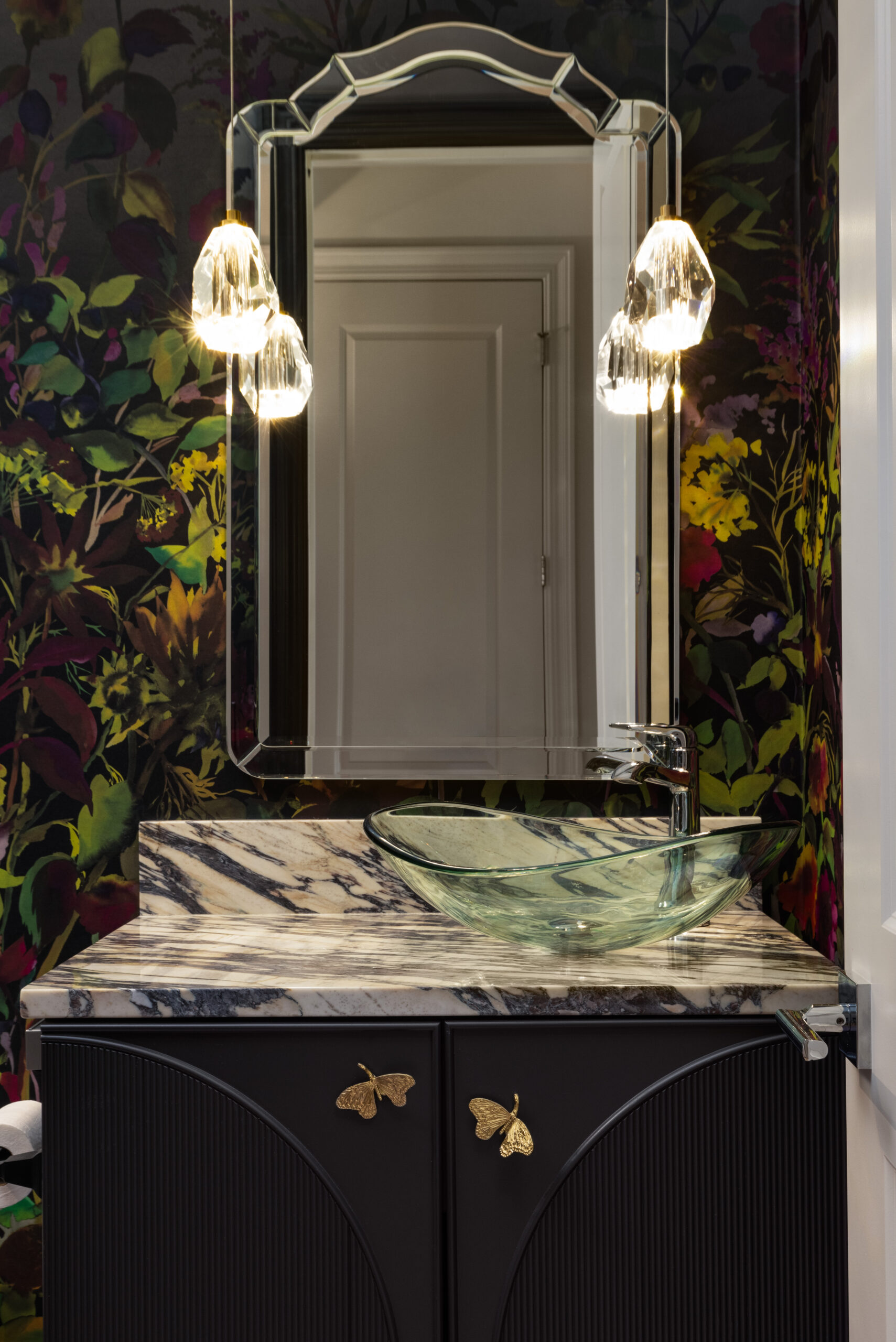
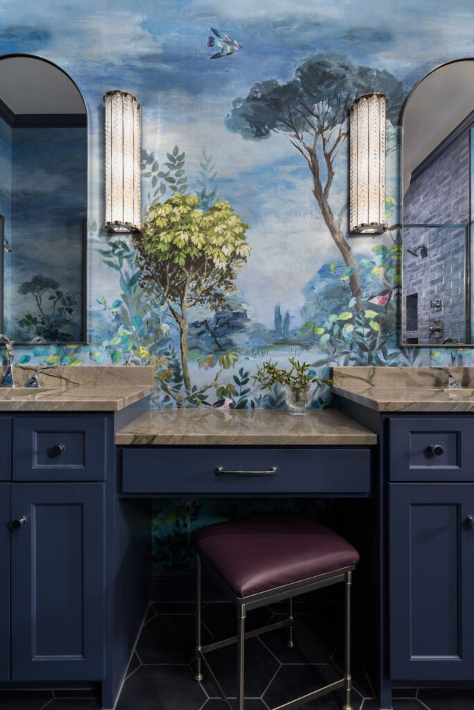
“Both the guest bath and primary bath are my favorites,” the homeowner says. “The guest bath’s dark floral pattern feels mysterious but still relaxing. The blue, airy mural in the primary bath causes everyone’s jaw to drop.”
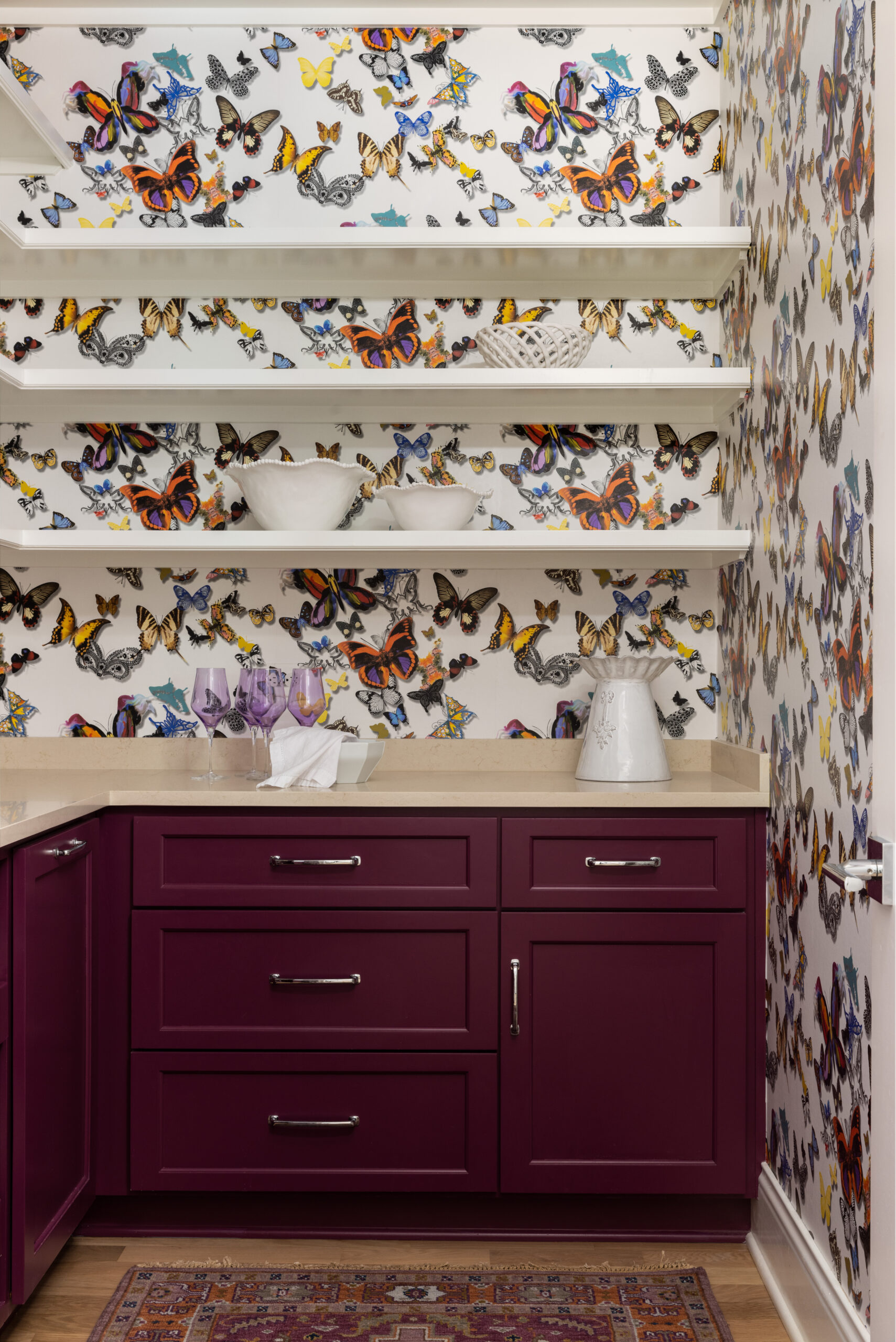
For Jill and Patrice, it’s a playful moment they added near the pantry that sums up the whole project. “We added these little butterflies from MacKenzie-Childs with really intense pattern and color. One on the chandelier, one on the closet handle and one on a cabinet knob…They look like they’ve flown in from the pantry. It’s just joyful and fun.”
In other words, far from neutral.


Leave a Reply