An Elevated Update
Words by Katy Schamberger | Photos by Laurie Kilgore
Dark hues, jewel-toned fabrics, cool marble, warm wood—this redesign by Stephanie Stroud is a study in the art of contrasts.
esigner Stephanie Stroud’s signature move is combining classic and current, a look for which the owner of this Overland Park home hired her when renovating an aging kitchen.
The original scope of work included remodeling the kitchen and adjoining hearth room, along with updating the living area and an enclosed library. But after discussing how much the client loves to cook and entertain, the project expanded by relocating the laundry room upstairs—a big boost in convenience to the home’s second-floor bedrooms—and transform the space into a walk-in pantry, complete with coffee bar, built-in oven and ample storage.
As Stephanie and her client explored these possibilities, she quickly realized they were already on the same page in terms of both function and flair.
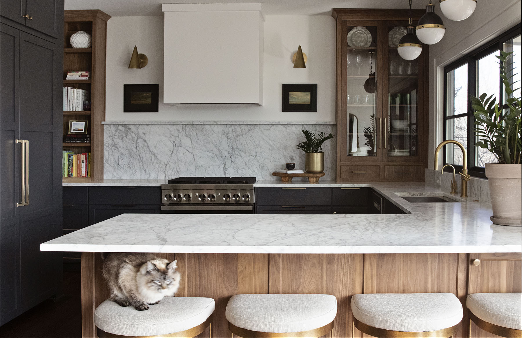
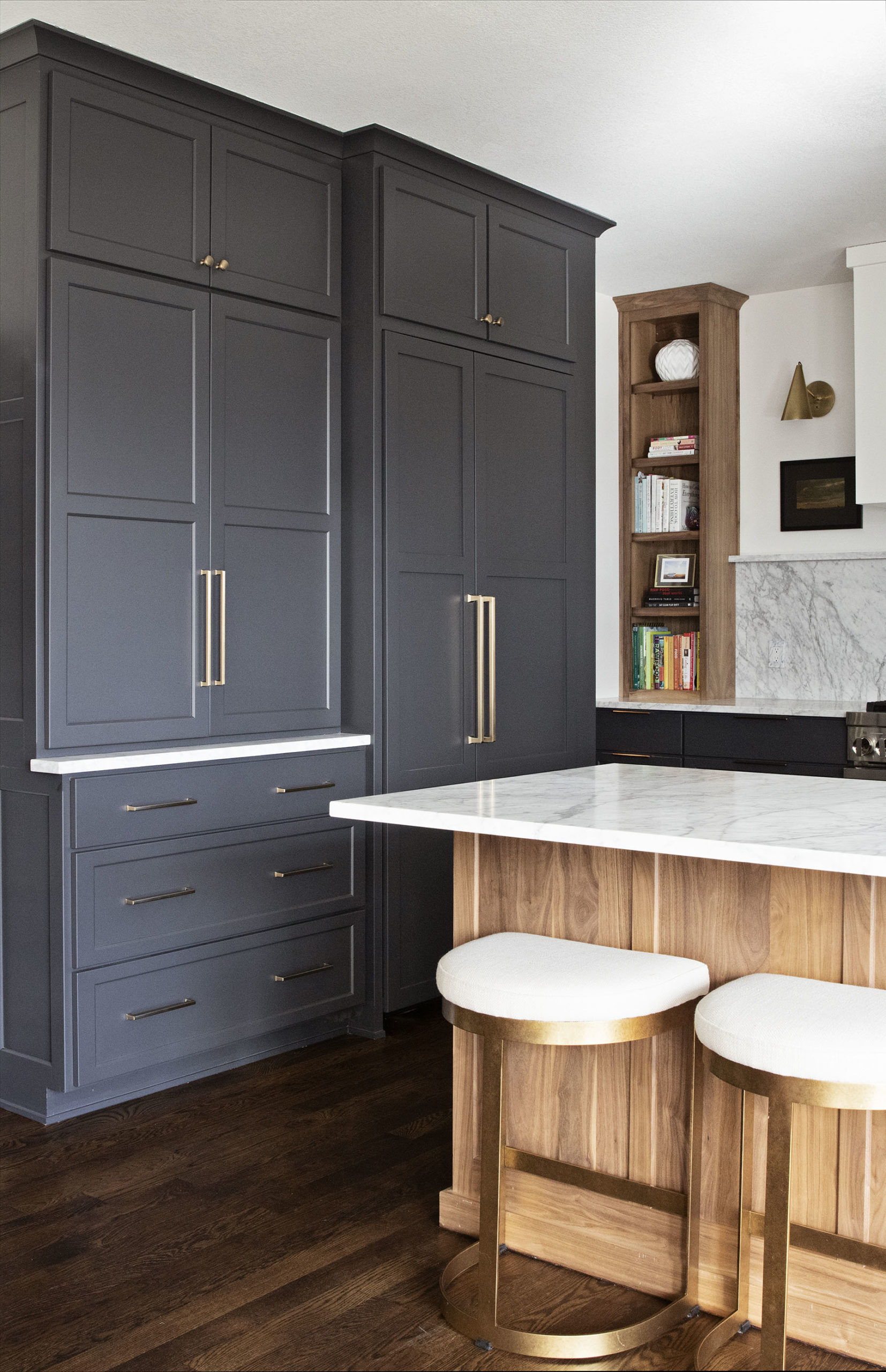
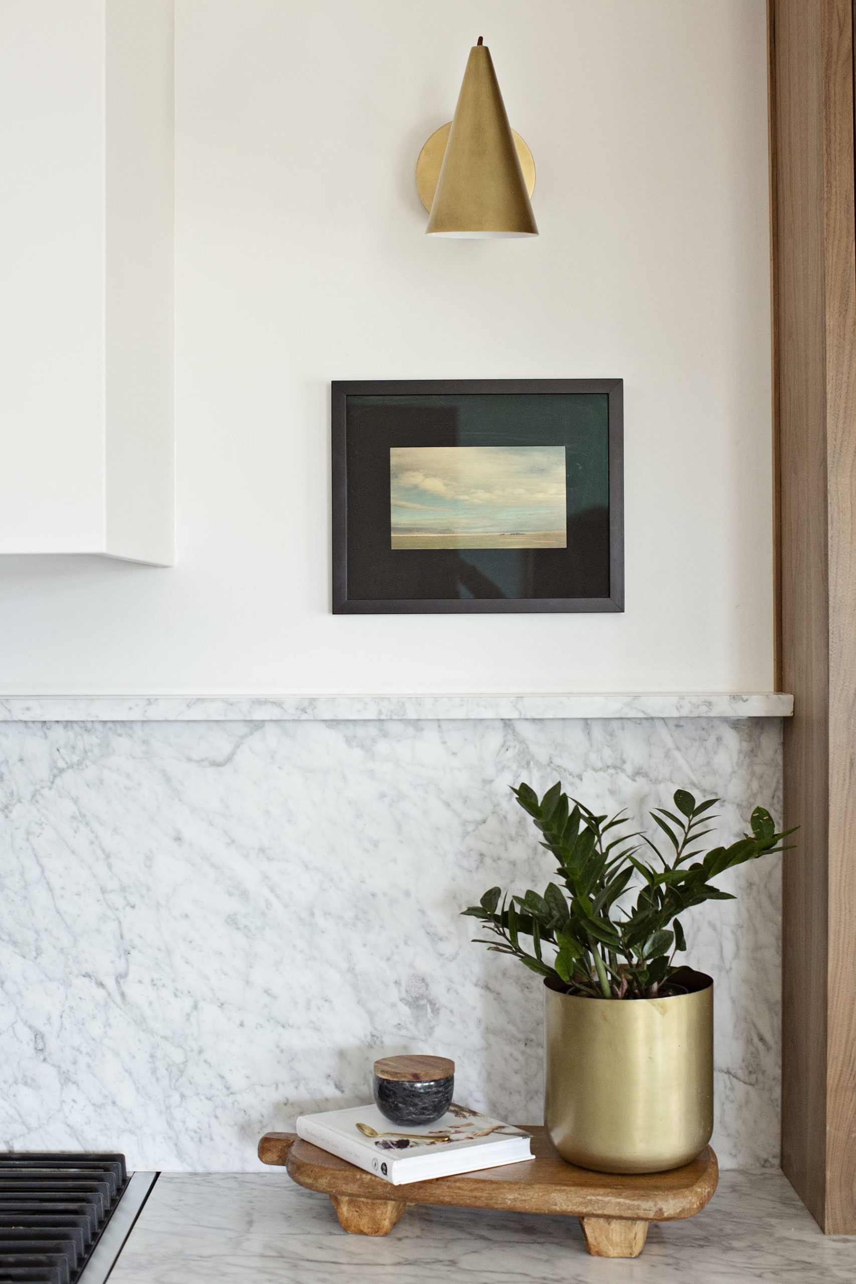
“Our visions were consistent from the beginning,” Stephanie says. She describes the overall aesthetic as “moody but timeless.” In the open kitchen, which was completely gutted and redone, dark gray walls and lower cabinets anchor the space. A sleek range, brass plumbing and drawer pulls, and marble backsplash and counters add a brightness that balances the darker hues.
“I love that the client went with marble,” Stephanie says. “People are afraid of using it, but it’s been around for thousands of years and it’s all over Europe. The client wanted to use natural stone and was also fine with the patina that will develop as the material ages.”
To better help Stephanie achieve her favorite combination of classic and current, she introduced an eye-catching mix of materials to the kitchen (and throughout the rest of the remodel). Walnut cabinets with glass doors introduce an inventive take on a china cabinet while also breaking up the expanse of marble countertop. And in contrast to other kitchen remodels she’s done, Stephanie opted to diminish rather than highlight the stove hood.
“We wanted to focus more on the shelves and stone and what’s going on around the stove,” she explains.
While the remodel was underway, the homeowners also had new windows installed. That introduced an opportunity to add windows in the kitchen, replacing a single window with a large bank of windows above the kitchen sink.
The Transformative Power of Details
The kitchen flows into a cozy hearth room where the clients spend a lot of time, typically with steaming mugs of coffee to start the day. That meant Stephanie didn’t want to necessarily start from scratch; instead, she opted to elevate the hearth room by extending the kitchen’s vibe.
A deep green—even darker than the kitchen cabinets—surrounds the two-sided fireplace, which is trimmed in the same marble used on the kitchen counters and backsplash. Above the fireplace, a painting by local artist Chris Dahlquist provides a sophisticated infusion of color that’s highlighted by candlestick-inspired wall sconces. “The clients love art and are committed to using local art and one-of-a-kind pieces,” Stephanie notes.
The splurge of the project? An L-shaped banquette upholstered in plush dark green velvet, the perfect fit for a corner space that also serves as the home’s dining area. The banquette, table and coordinating chairs are flanked by two walls of soaring windows that infuse the space with natural light. The windows’ black trim coordinates with the other dark hues in the room, creating a visual pop against white walls.
Despite the abundance of windows, Stephanie paid special attention to one particular area: lighting.
“To me, lighting is critical in every project,” she says. “It really finishes the space.”
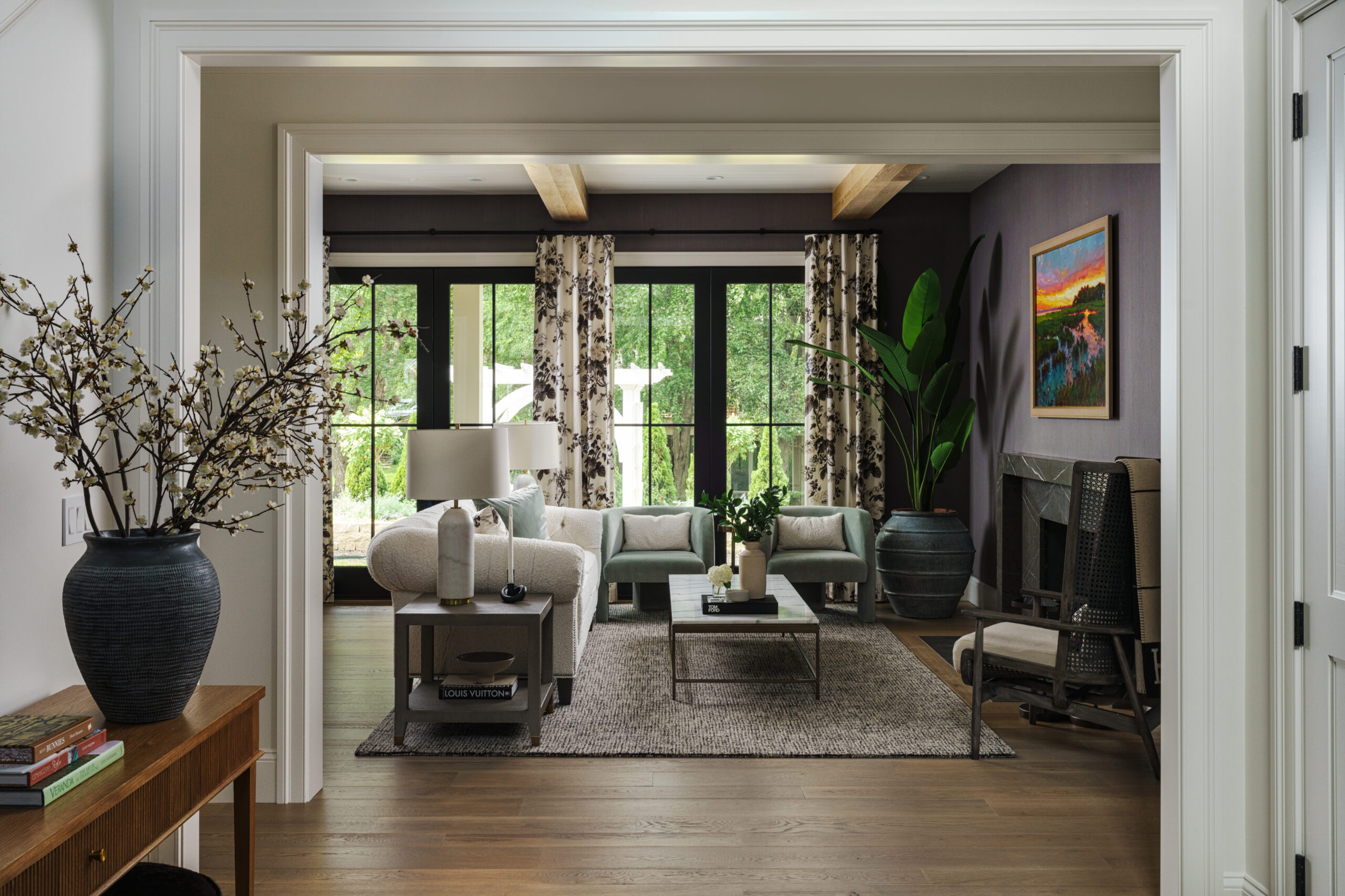
The project continues into the living area, located on the other side of the fireplace, and in the home’s library. In those spaces, Stephanie opted to update them with new lighting, furniture and accessories so that both rooms would complement the newly established aesthetic in the kitchen and hearth room.
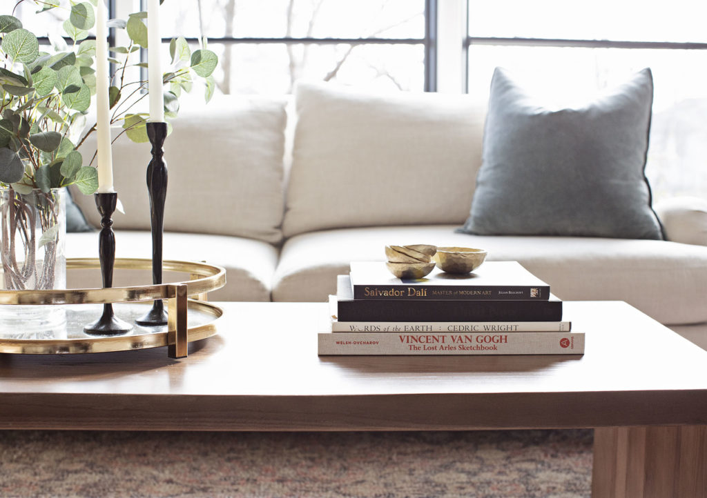
She applied the same degree of balance in these rooms, offsetting dark and light hues. In the library, which already had dark walls and a dark ceiling, a white concrete coffee table adds an appealing mix of brightness and texture in a way that Stephanie says is almost “the reverse of the kitchen’s color scheme.”
It’s safe to say that Stephanie accomplished her “love where they live” goal—and then some—with this project. She credits part of her success to the homeowners, who shared her enthusiasm for the ultimate vision.
“They were really dream clients,” she says. “They get it, and she’s also got a great eye.”
Resources
Interior Designer: Stephanie Stroud Interiors
Art: Chris Dahlquist, from Prairiebrooke Arts
Cabinets: Overland Cabinets
Countertops: RockTops
Hardware: Emtek
Barstools: Uttermost
Glass and Mirror (in pantry): Fountain Glass
Plumbing Fixtures: Kohler
Lighting: Visual Comfort
Orange Chairs + Black Glass Cabinet + White Concrete Coffee Table: Four Hands
Rugs: Loloi
Green Banquette: Hickory Chair
Dining Chairs: Arhaus
Wall Mirror + Black/White Pillows: Anthropologie
Velvet Floral Pillows: Romo
Leave a Reply